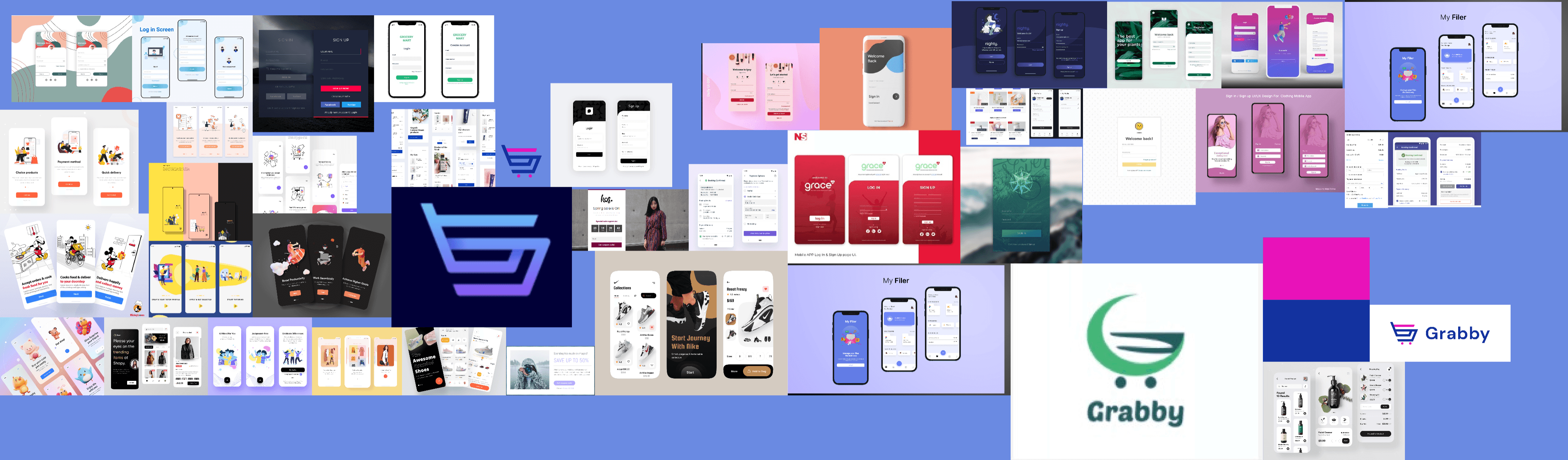
Grabby
Grabby is a SaaS aggregation platform that enables any SME manage their business. Grabby as a platform can be used by a Pharmacy, Restaurant, Super-market, Boutique, Shawarma/Suya eat-out, Spa etc to manage their daily business
Project Duration
12 weeks
Project Overview
Over the years, shopping has become easy and covenient. From the comfort of your home you can purchase products and have it delivered same day or in few days. However, as online shoppers increase, frustrations arise as well.
Grabby focuses on easing frustrations these constumers go through by categorising products which enables easy search, providing alternate payment methods, scheduling a delivery and also tracking your product once your order has been shipped. The project also enables communication between the merchant and the customer.

Our Roles
Combined UX/UI Designer
Tools

The Goal
The Problem
The Grabby project tends to address the above problem statement by properly categorizing these products and also offering logistics services to the comfort of shoppers houses for easier and better user experience thereby leaving customers/shoppers satisfied after a shopping experience.
Shopping online has been a norm in recent times. People choose to shop any product of choice from the comfort of their homes which has made stores less crowded and also made life easy for shoppers and business owners.
However, shopping online can be difficult most times especially when not properly categorized as such leaves the shopper frustrated when searching for a product.
Furthermore, shoppers now prefer the options of having their goods and services delivered at the comfort of their homes without hassle.
My Role
Design Process
The design thinking process for Grabby application involves five processes from the Empathy stage, Define stage, Ideation stage, Prototype stage and finally the Testing stage.
User Personas
Empathy Map
Pain Points
User flow
Brainstorming
Card Sorting
Information Architecture
Low-fidelity
Wireframe
High fidelity
Prototype
Usability Testing
Detect the Problem
Detect the Goal
User Interviews
Competitive Analysis
Empathize
Define
Ideate
Prototype
Test
IDEATE
User flows
Moodboarding
Low fidelity wireframes
EMPATHIZE
User stories
User personas
Questionnaires
Usability test


TEST
Fully test prototypes
Fix issues identified
DEFINE
Clarifying objectives
Understanding the problem source
PROTOTYPE
Visual design
Dynamic high fidelity wireframes


Pain Points
Pain point 1
1
Delay in delivery & tracking of products.
Pain point 2
2
Long and complicated checkout process.
Pain point 4
4
Inability to shop by categories.
Pain point 3
3
Unresponsive and bad online shopping app.
Low Fidelity / Sketching
Moodboards and Design System
#E812B9
Grabby Shocking Pink
#F14ABC
75%
#FC9FCD
25%
#F86EBF
50%
#FDCFE1
10%
#13329F
Grabby Egyptian Blue
#4362C5
75%
#9EB8F5
25%
#6A8AE2
50%
#CEDBFA
10%
#212121
Grabby Black
#FFFFFF
White
#666666
75%
#E5E5E5
25%
#B2B2B2
50%
#F2F2F2
10%
Brand Colors
Brand Shades
Brand Colors & Brand Shades
#A3D804
Success
#C1E73D
75%
#EAFB98
25%
#D6F364
50%
#F5FDCB
10%
#FFA500
Warning
#FFC23F
75%
#FFE699
25%
#FFD466
50%
#FFF4CC
10%

#FF3A78
Danger
#FF6B8B
75%
#FFB0B1
25%
#FF8896
50%
#FFDAD7
10%
#058EFF
Info
#43B4FF
75%
#9BE2FF
25%
#69CBFF
50%
#CDF3FF
10%
System Colors
System Shades
System Colors & System Shades
Colours
Iconography
Grabby
Moodboards
Typography
DM Sans is the only used font throught the kit. For the sake of development sanity, base REM value is 16px which is default for major browsers.
Typeface
Aa
DM Sans
The quick brown fox jumps
over the lazy dog.
Design System
Design system is a collection of reusable UI components. In it, you can define UI elements such as buttons as well as text elements and other elements that you're sure will be reused throughout the design file. This makes the design workflow very easy.
High Fidelity Mockups

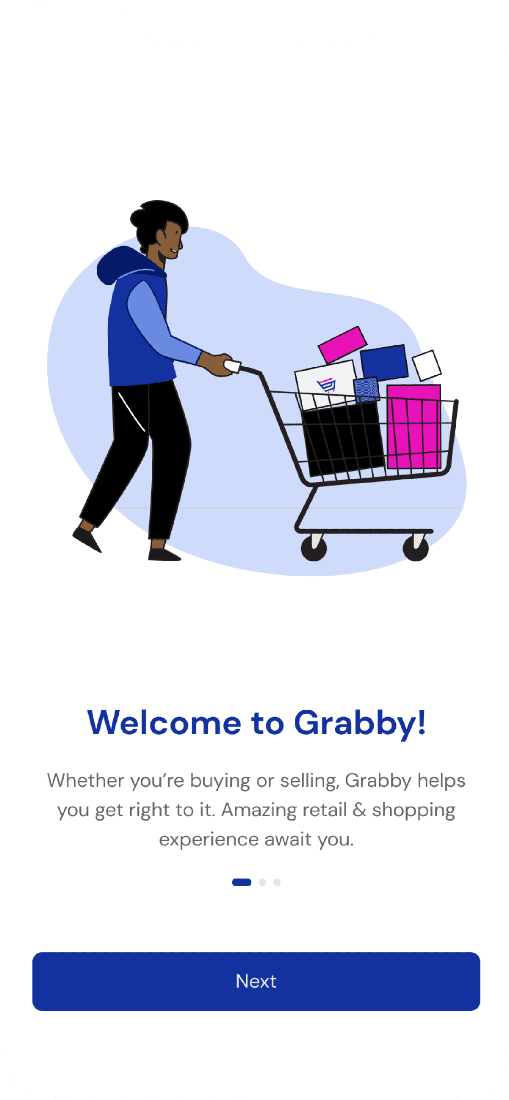
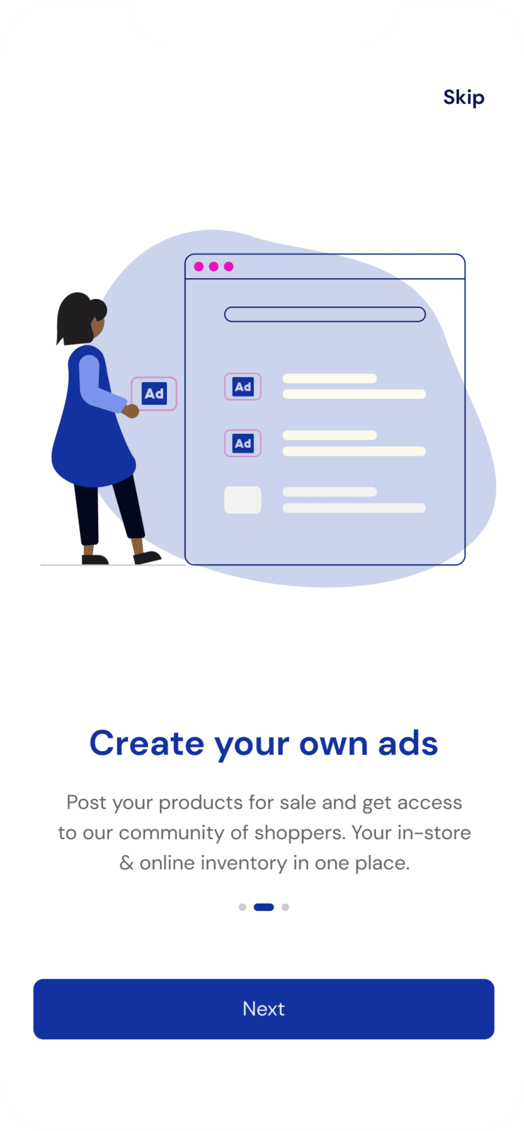
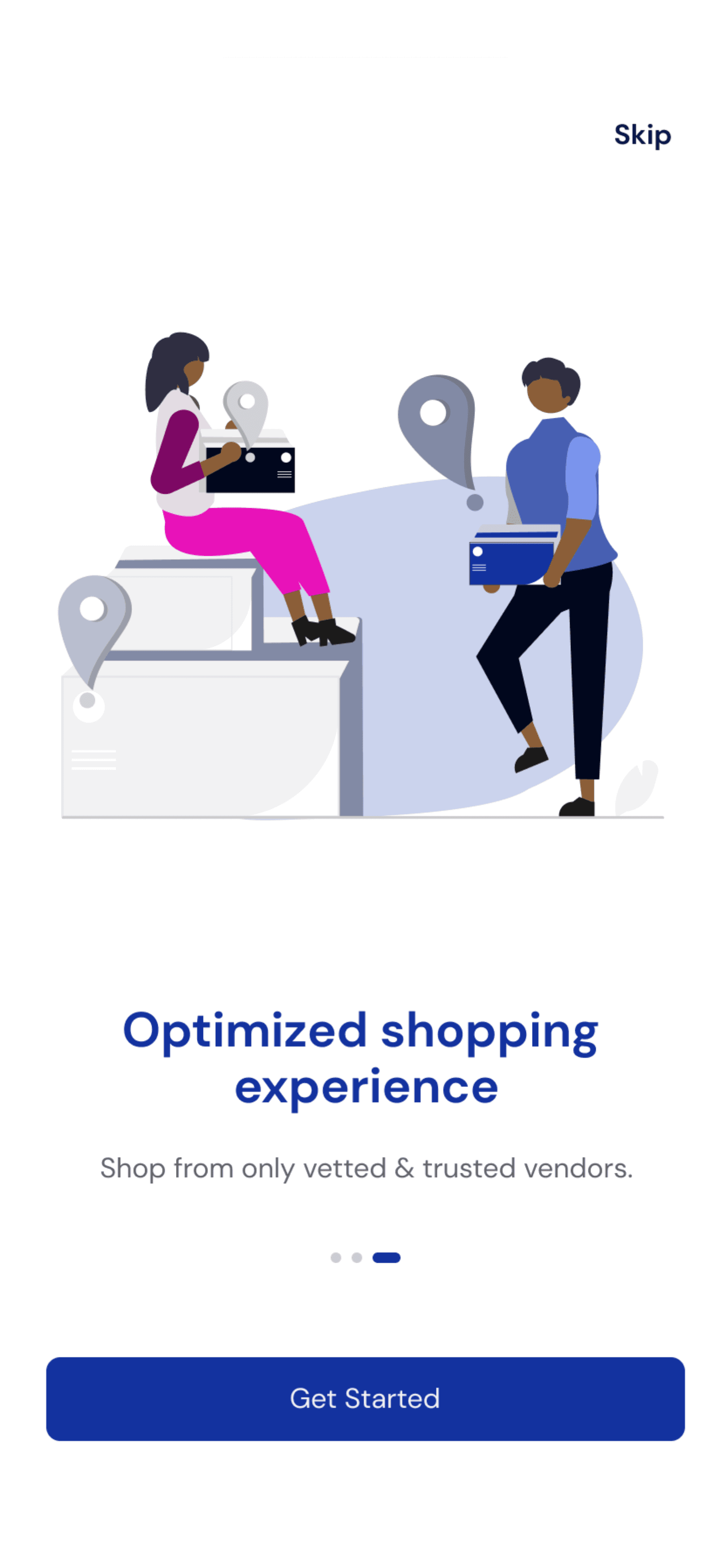
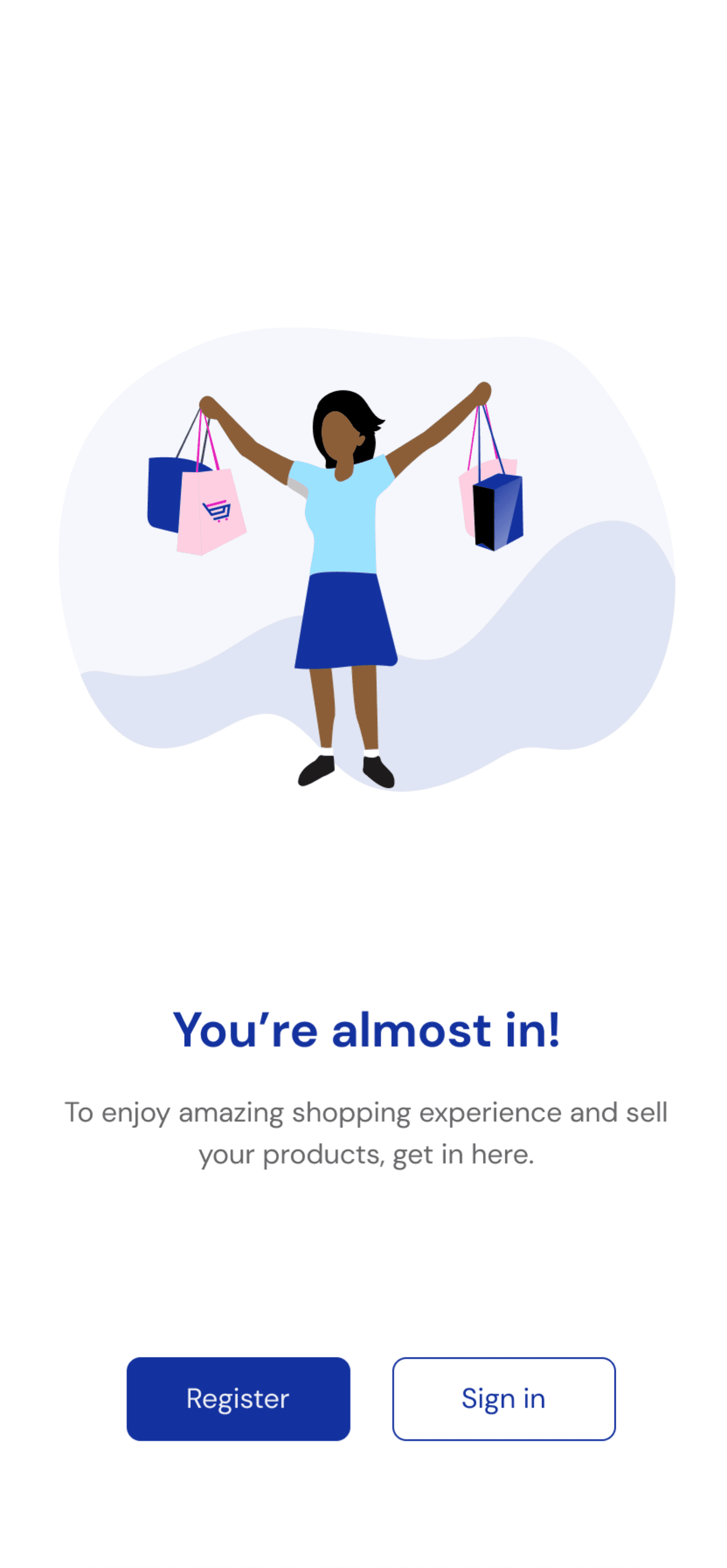
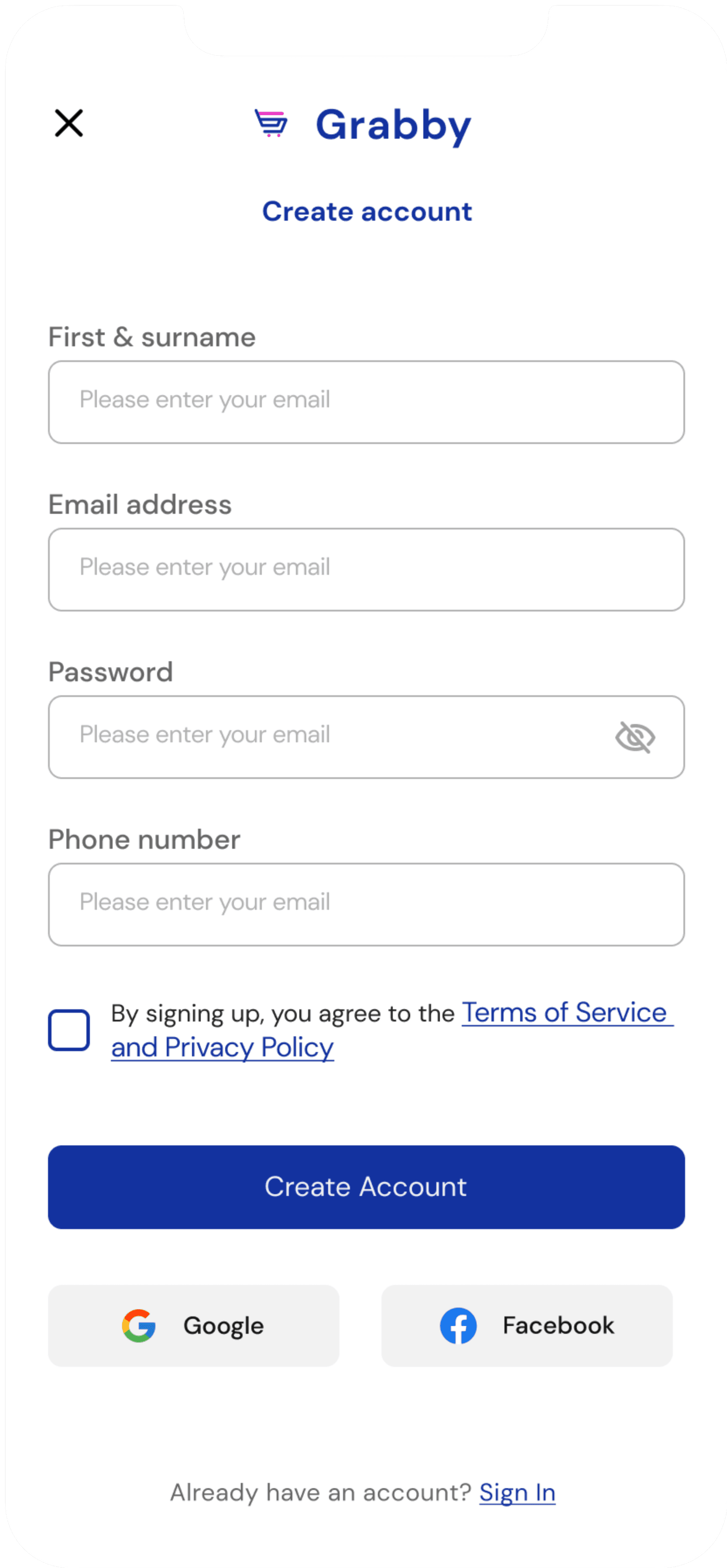
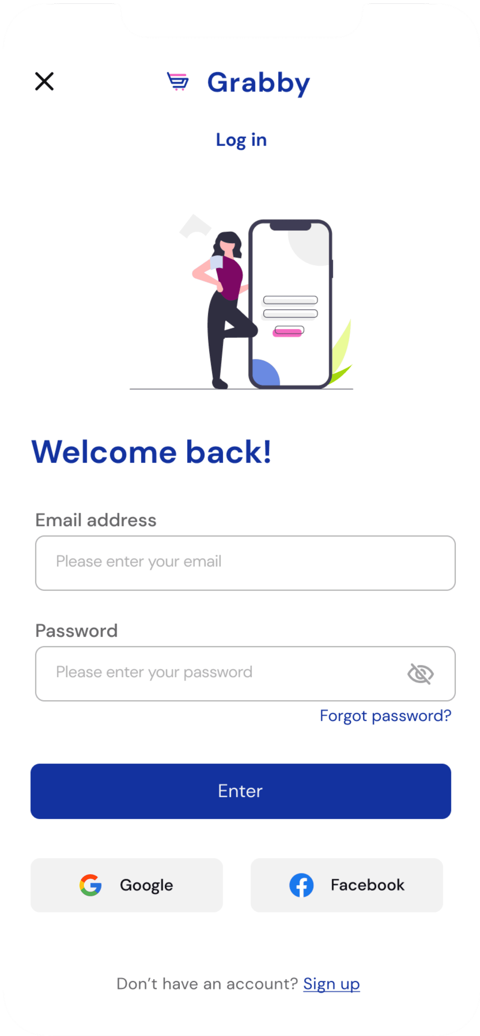
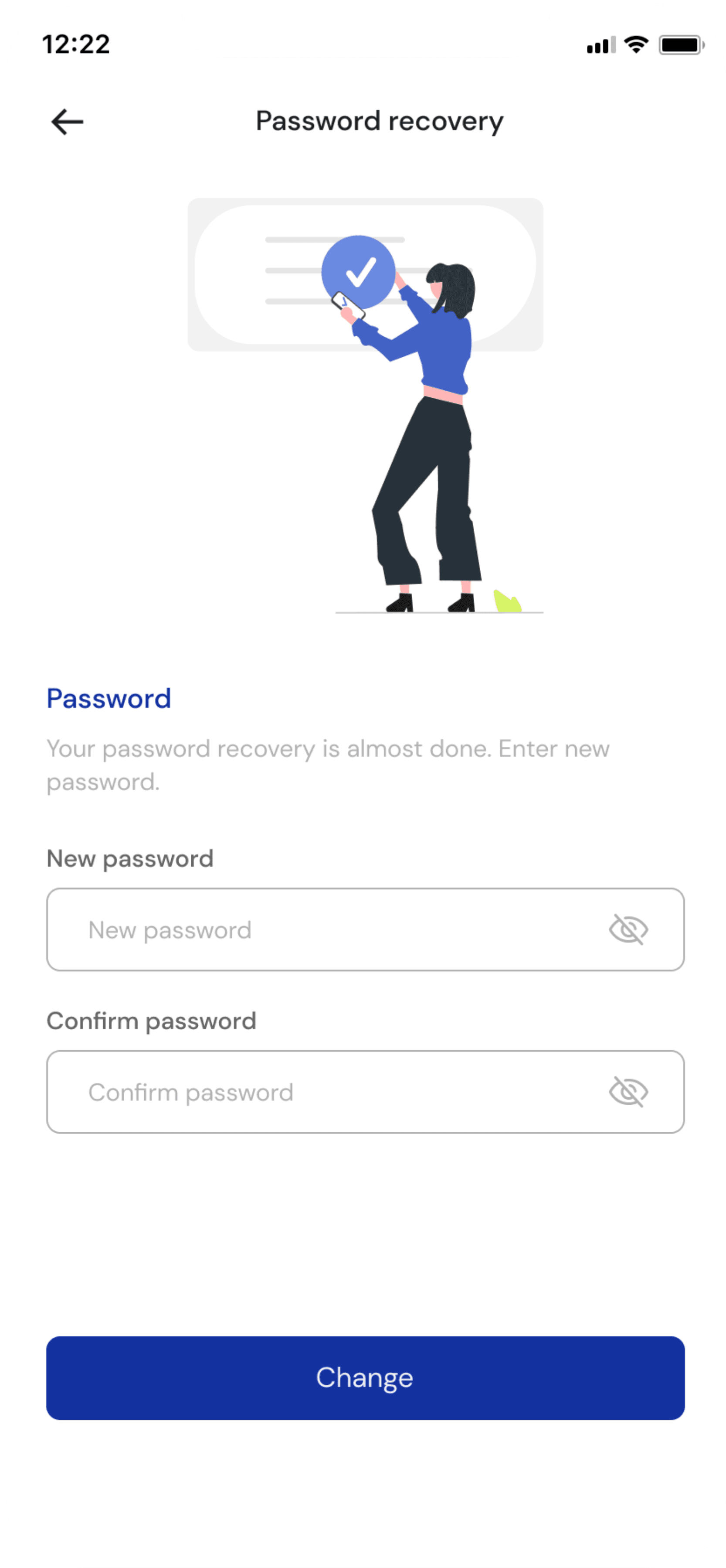
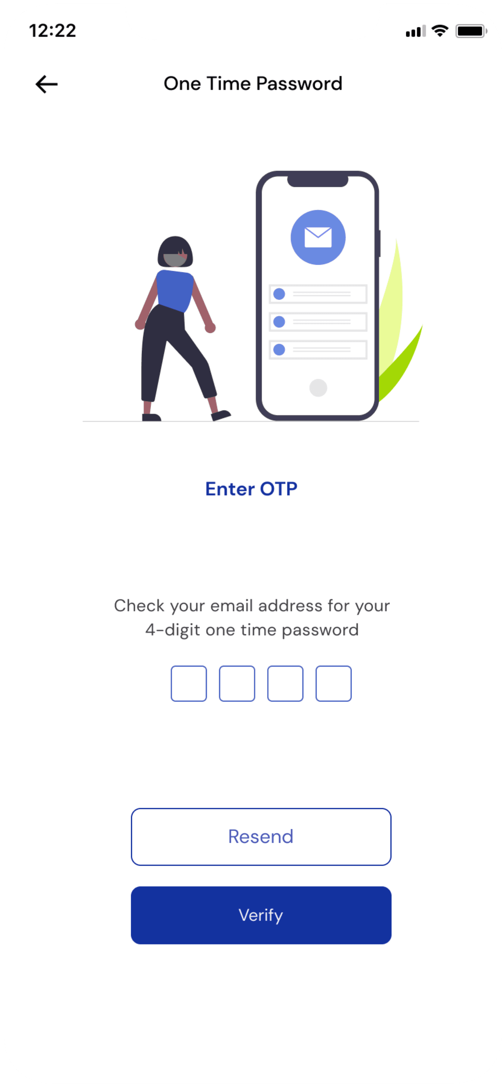
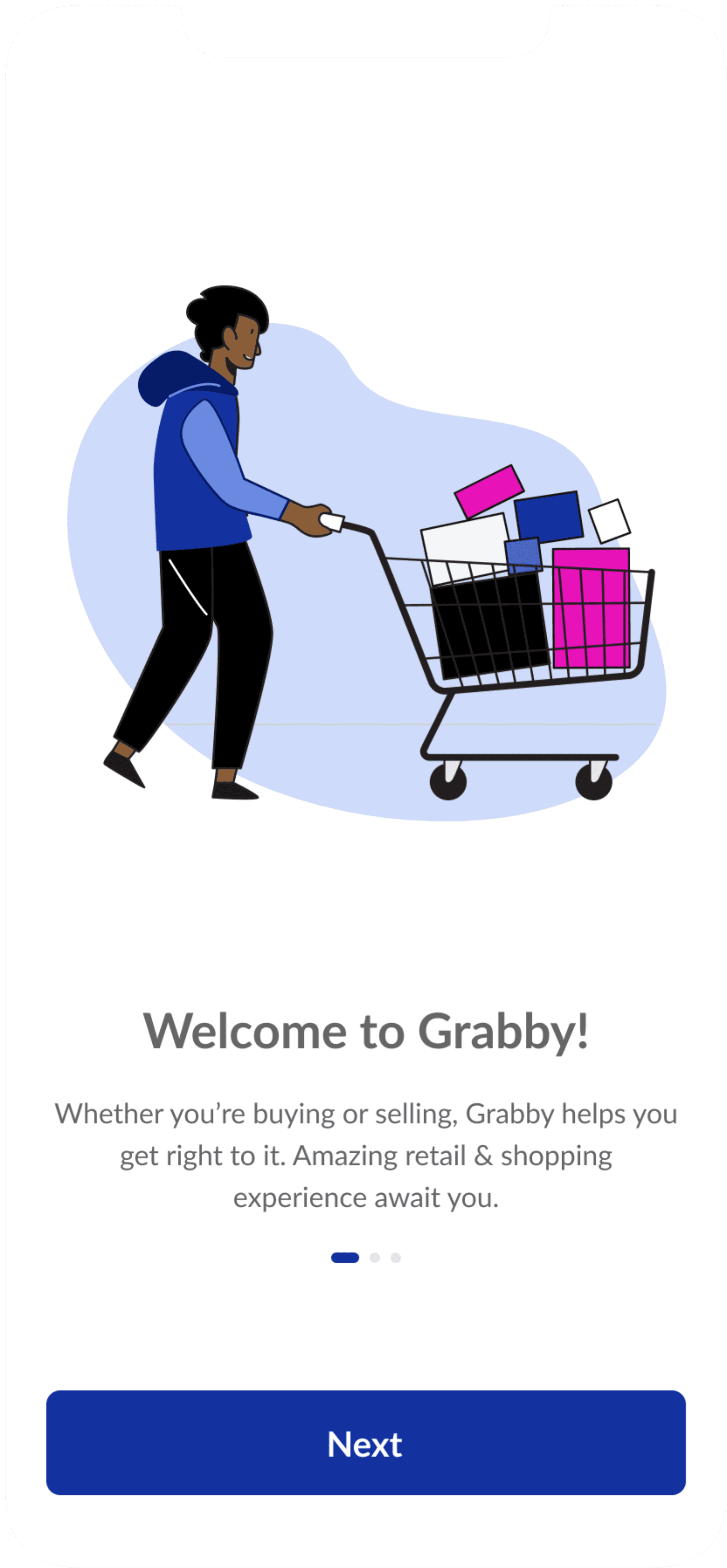
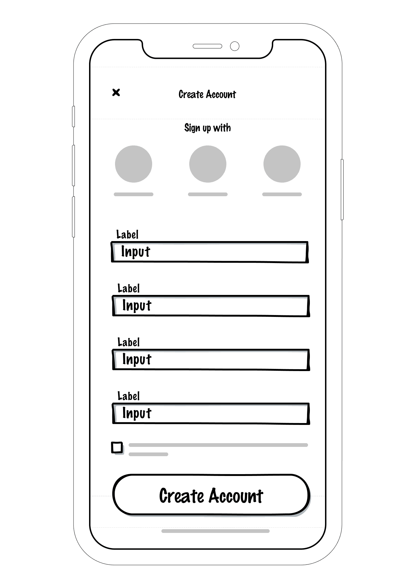
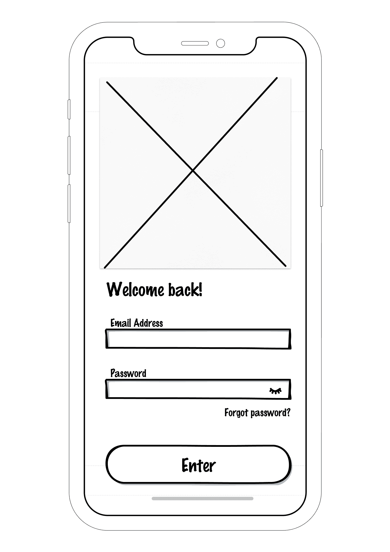
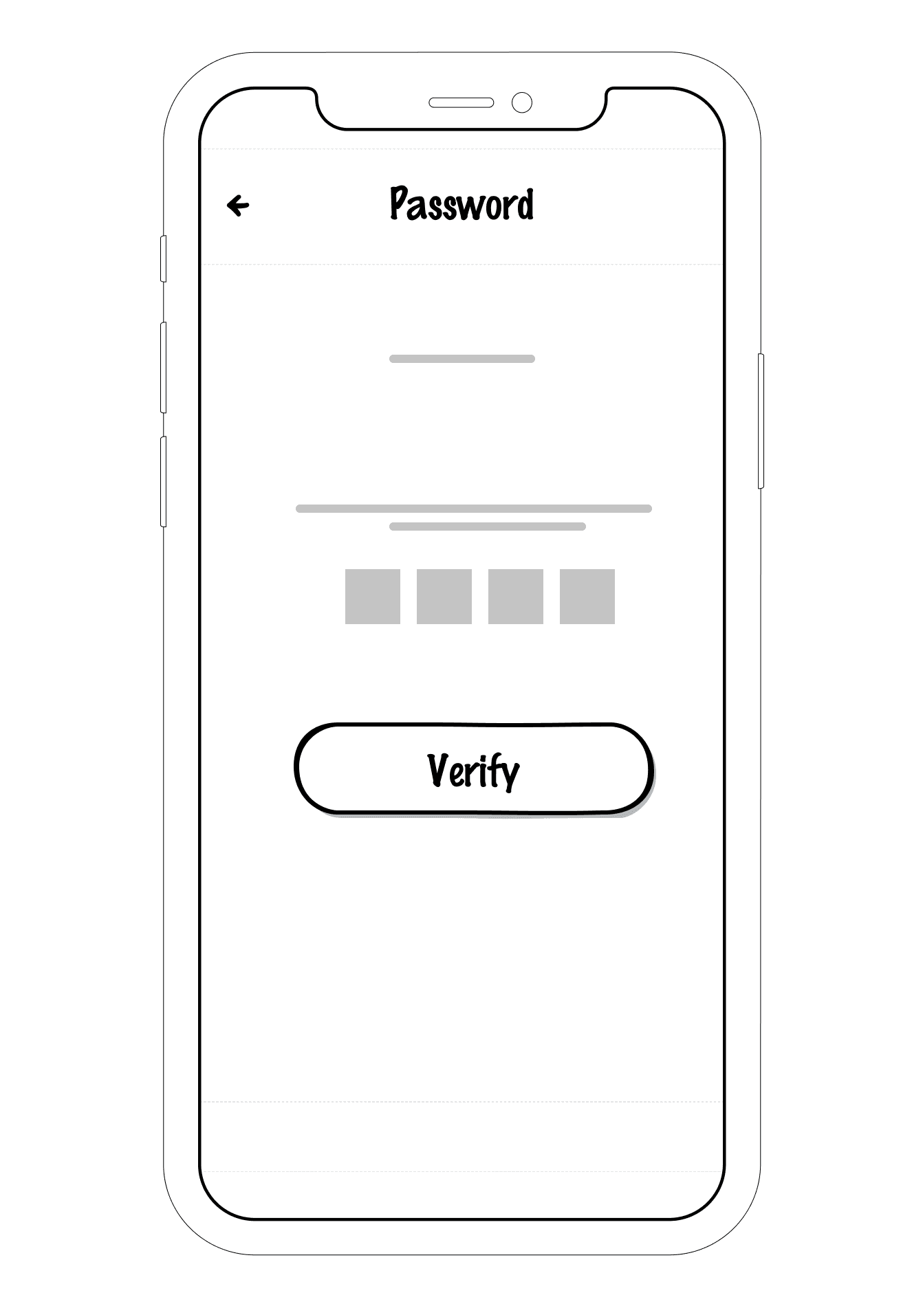
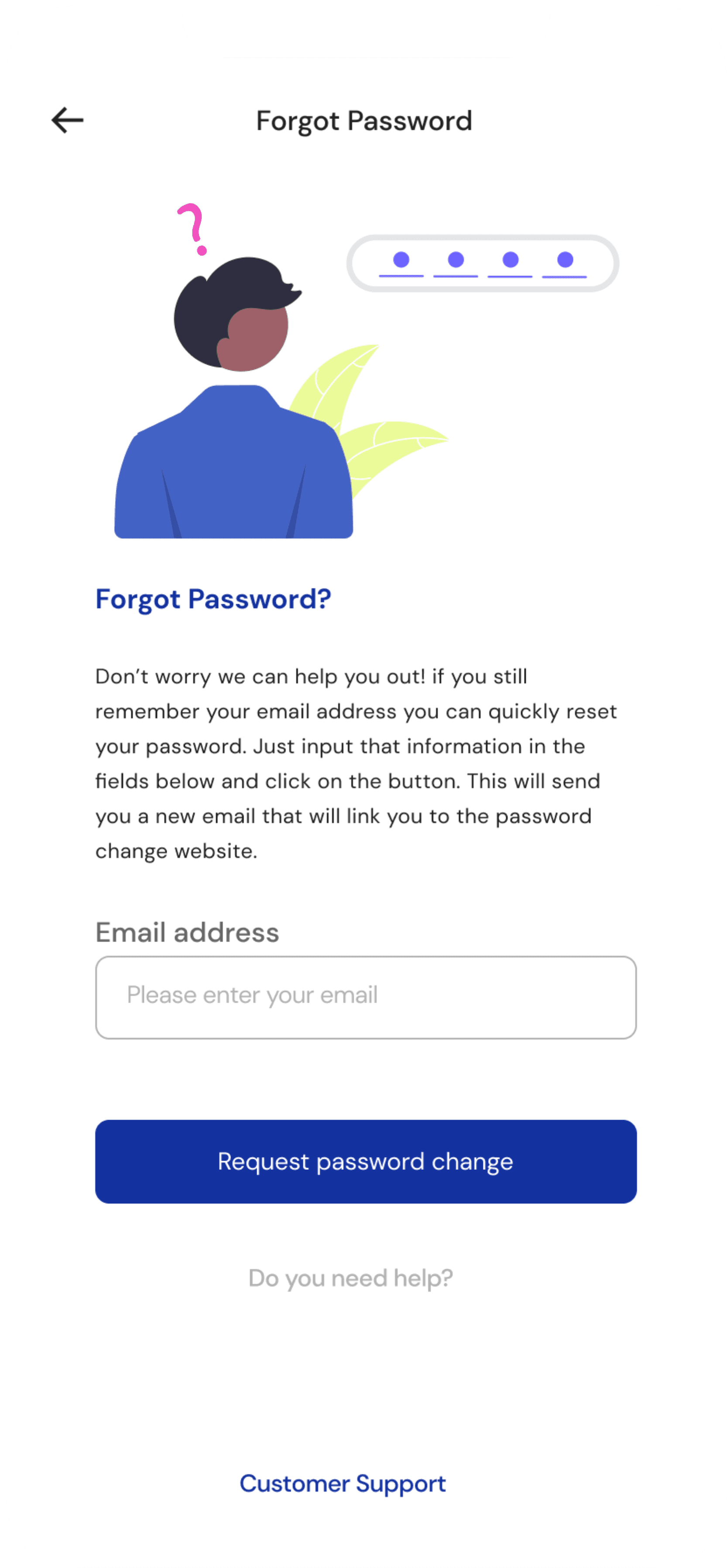
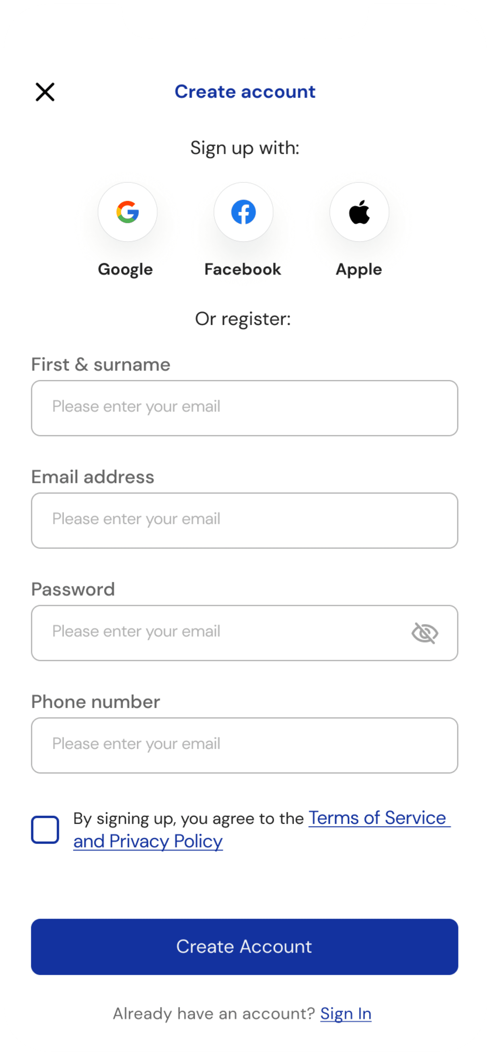
Onboarding / Authentication Screens
Intuitive and easy to navigate onboarding screens with the option to enable location for better, geo- location tailored suggestions.
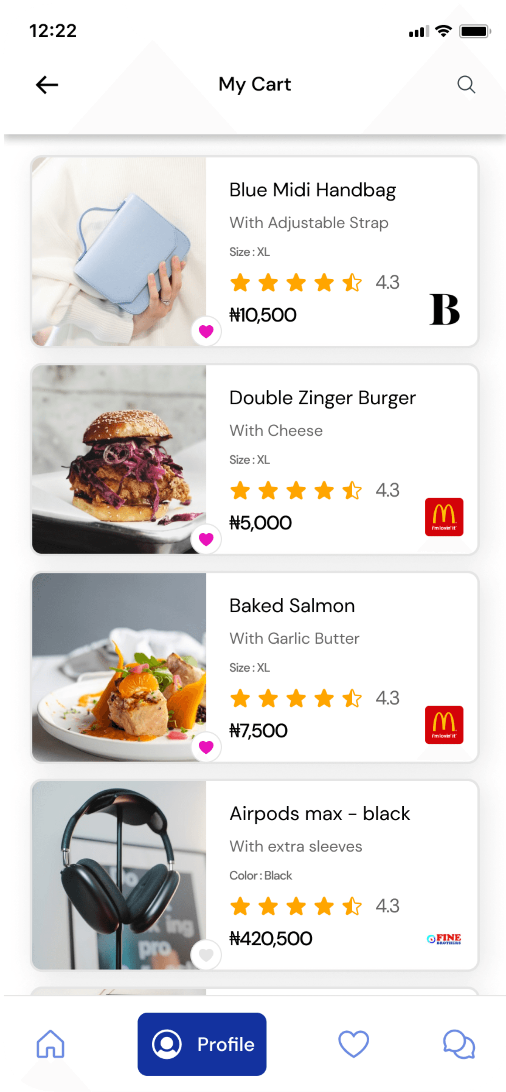
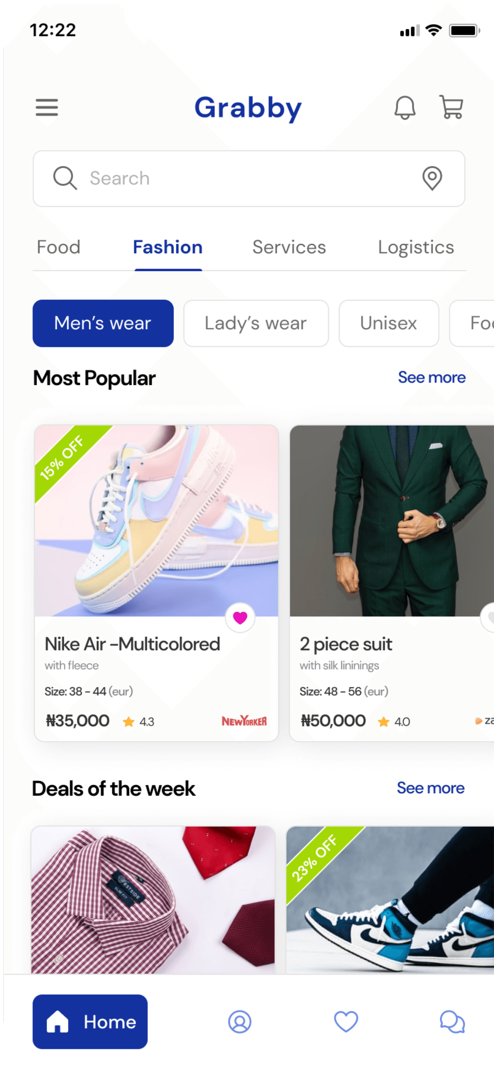
Home Screen
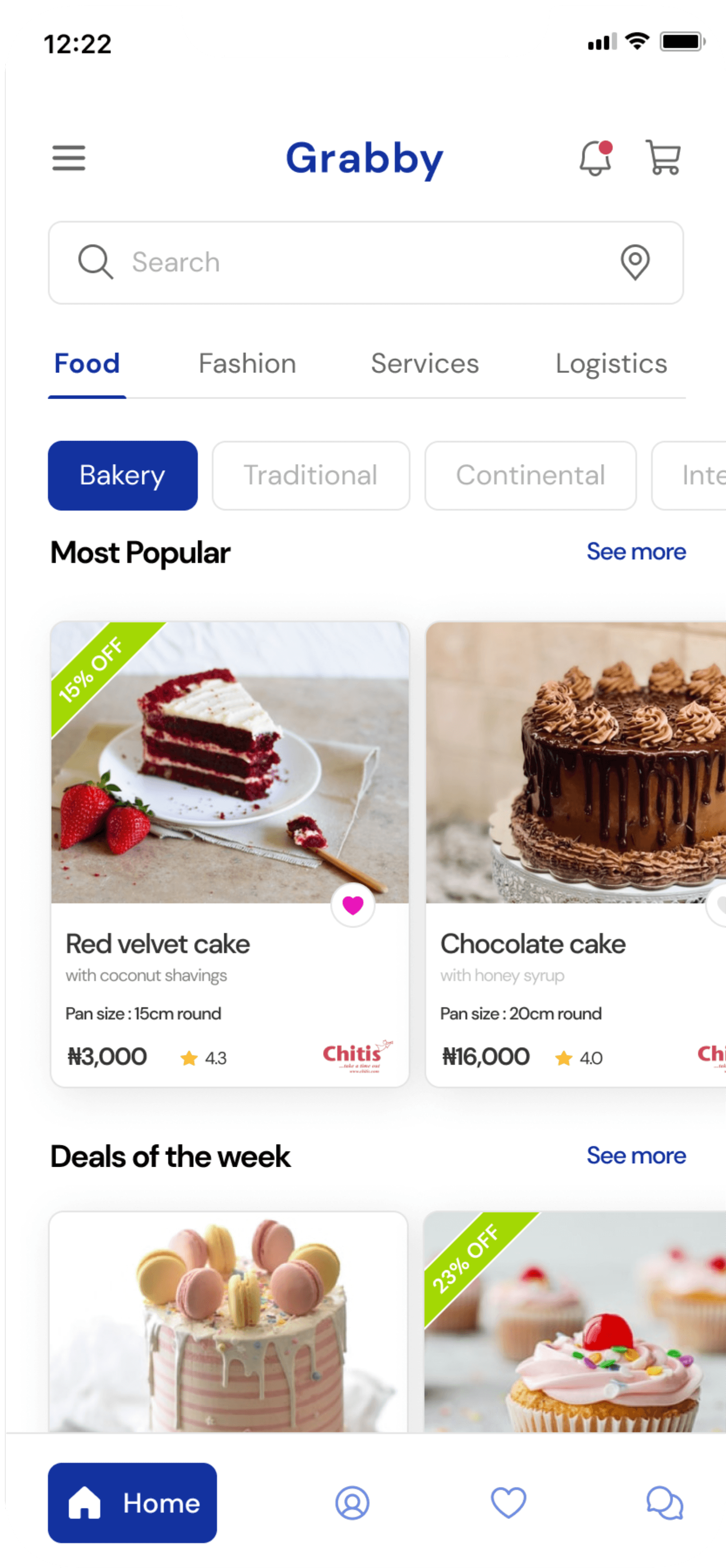
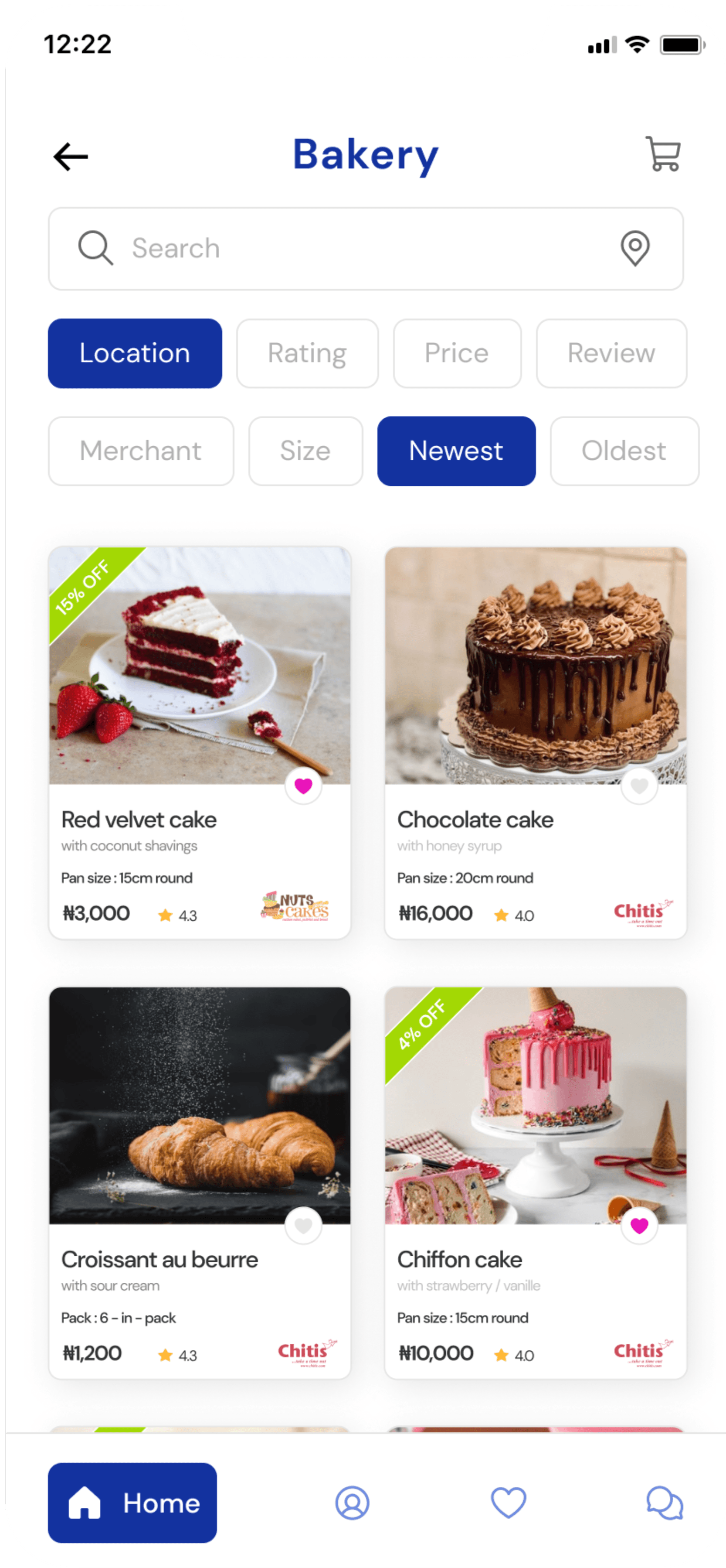
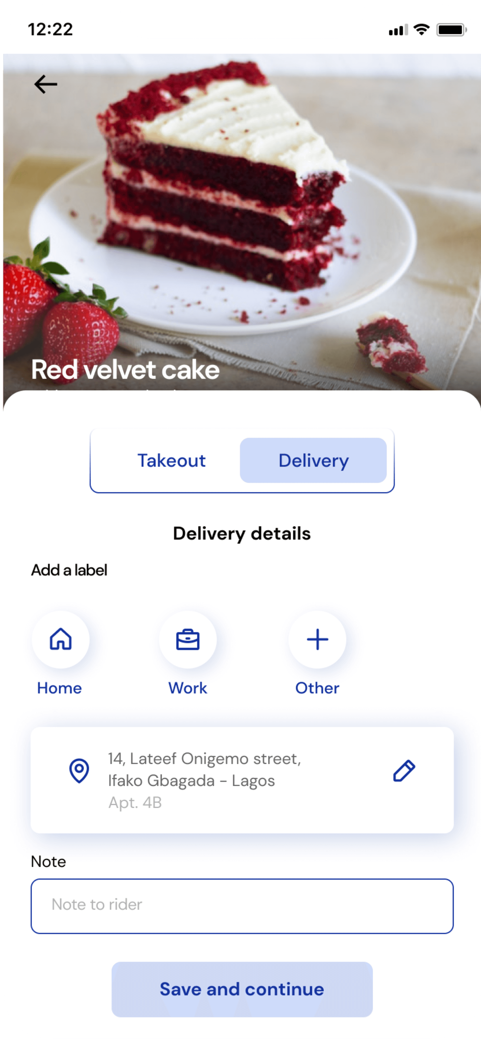
Red velvet cake
with coconut shavings
Pan size : 15cm round
₦3,000
4.3


15% OFF
Chocolate cake
with honey syrup
Pan size : 20cm round
₦16,000
4.0

Bread Cake
with sweet berries
Pan size : 15cm round
₦5,000
4.4

10% OFF
Nike Air -Multicolored
with fleece
Size: 38 - 44 (eur)
₦35,000
4.3

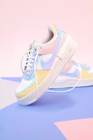
15% OFF
2 piece suit
with silk lininings
Size: 48 - 56 (eur)
₦50,000
4.0


3 piece suit
with 1 free shirt
Size: 46 - 58 (eur)
₦45,000
4.3

5% OFF
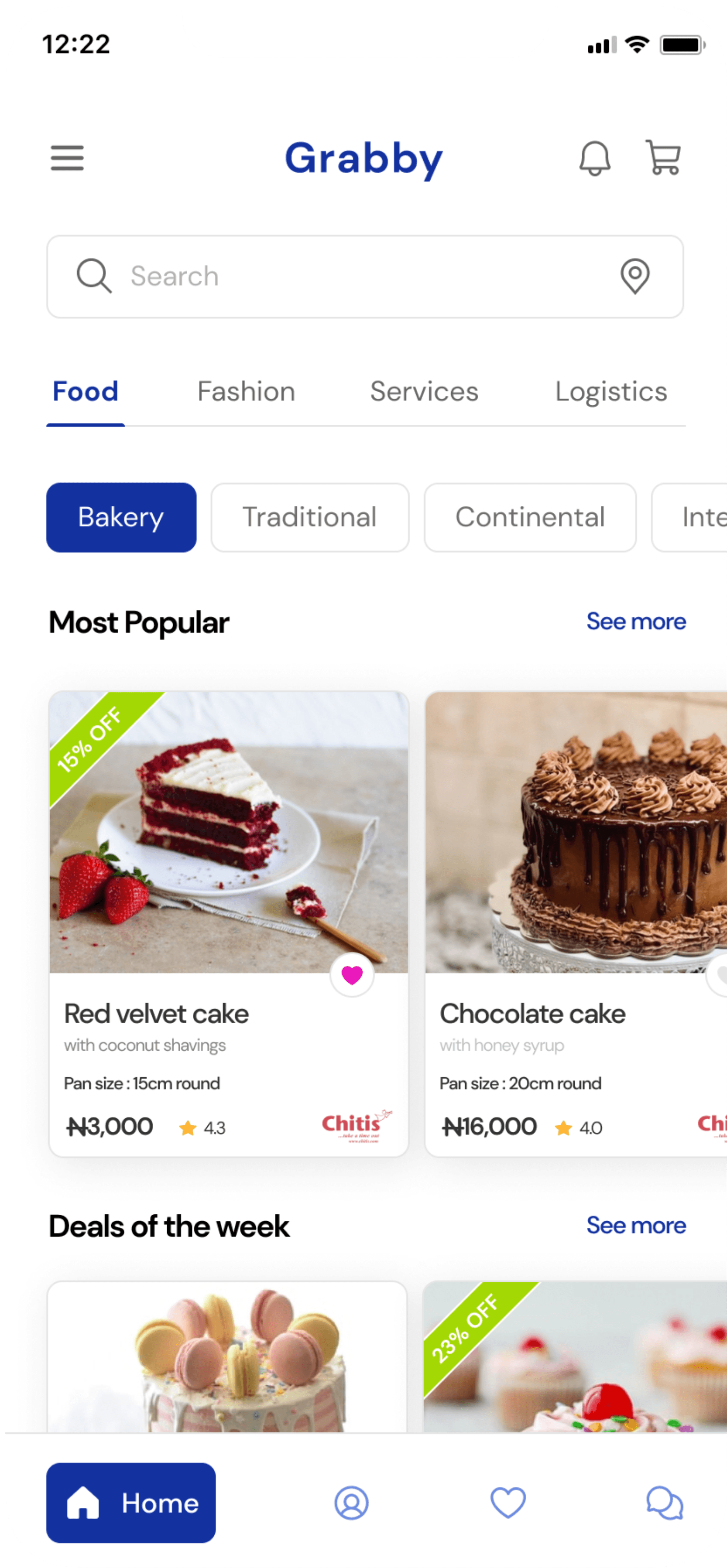
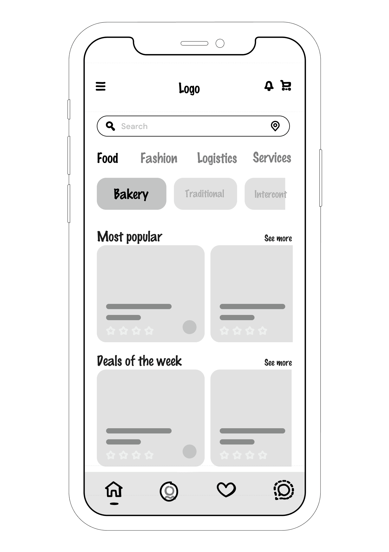
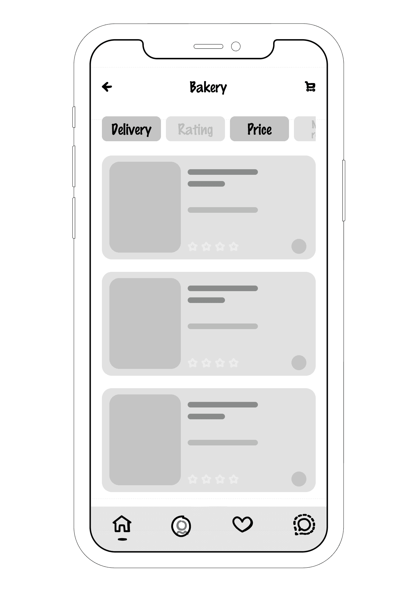
Bakery
Search
Location
Rating
Price
Review
Merchant
Size
Newest
Oldest
Filter
The filter option enables the user search for merchants / services either by location, merchant ratings, product prices etc., allowing for a personalized user experience on Grabby.
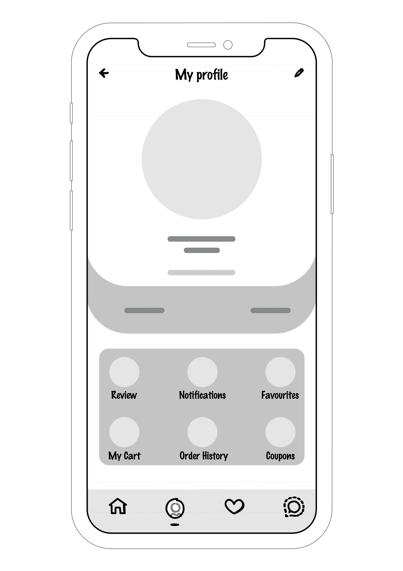
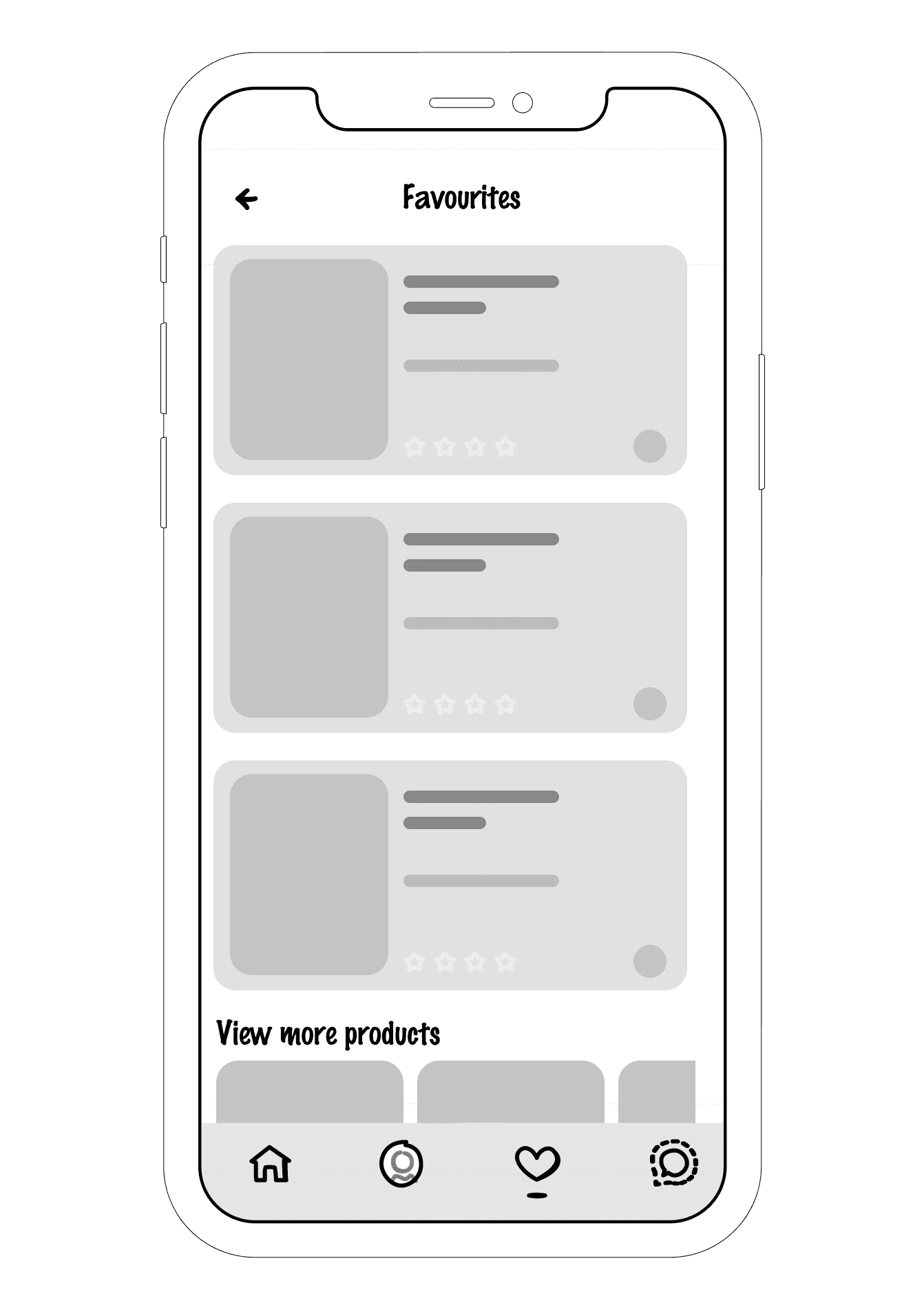
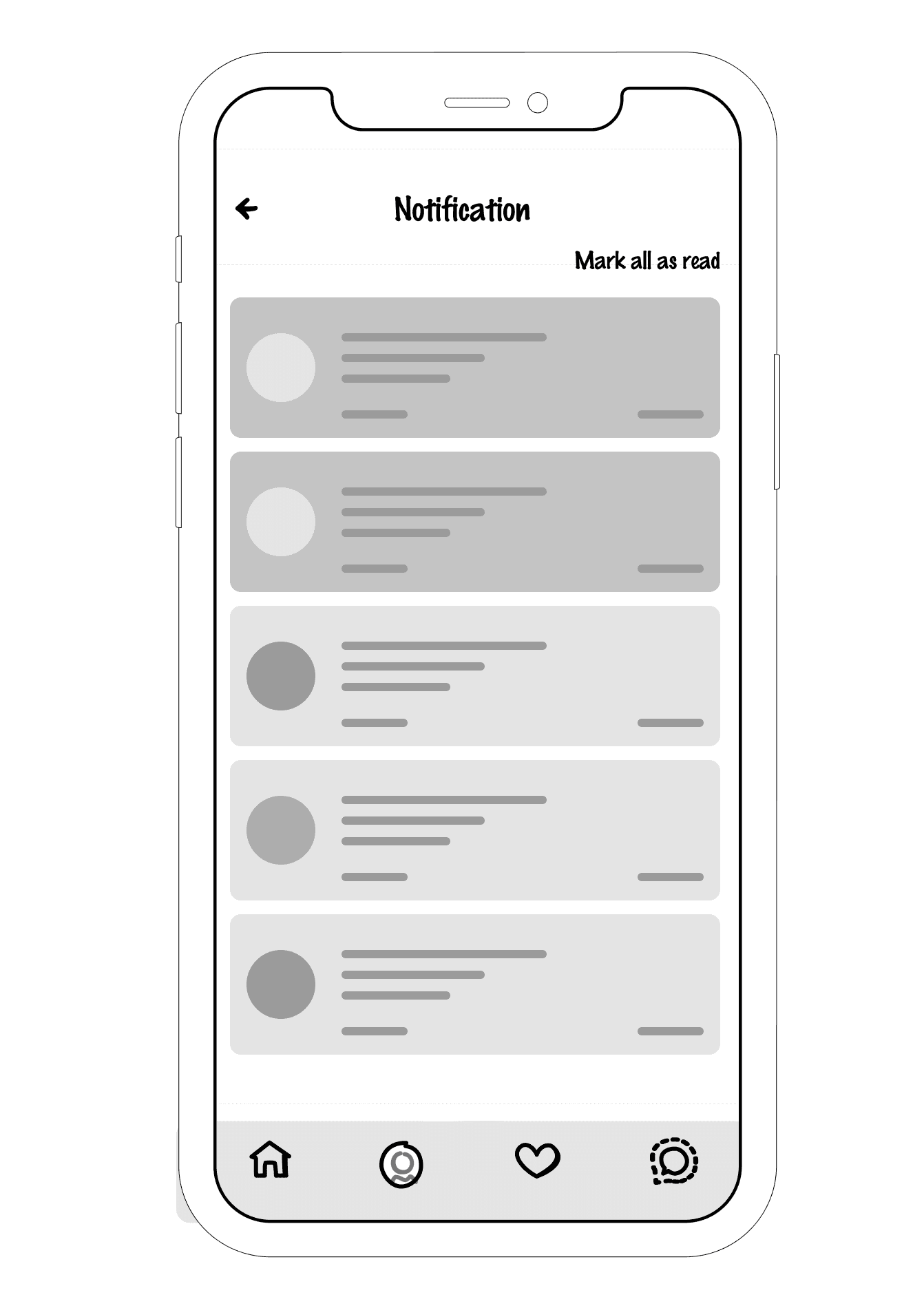
Grabby has a unique feature for easy access to more interactive options which are available to the user which includes location, order history and more accessible options.
The home screen features products displayed by the merchants and shows brief details about each item. It features a custom search option for easier product or merchant searches based on geo - location or broader searches.
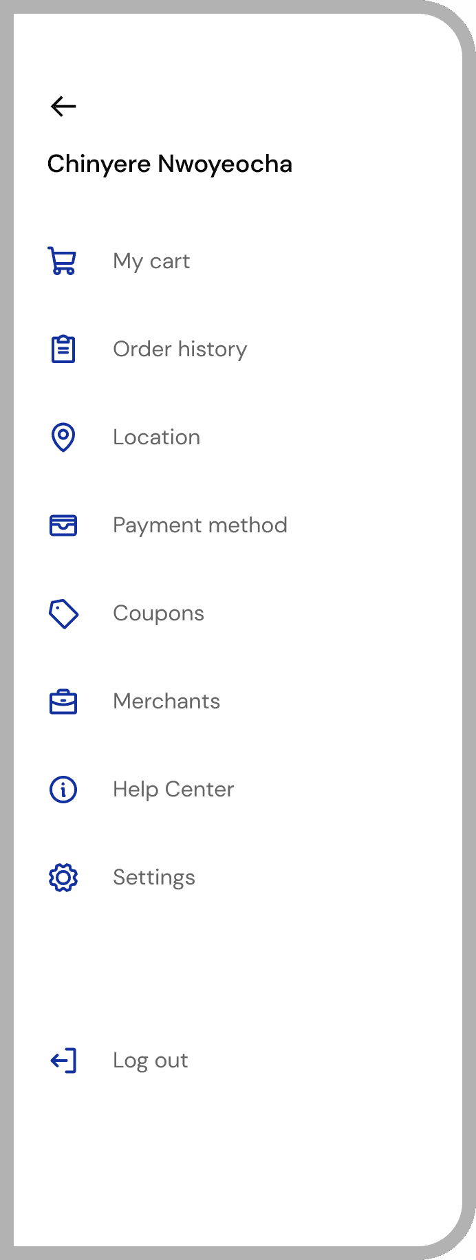
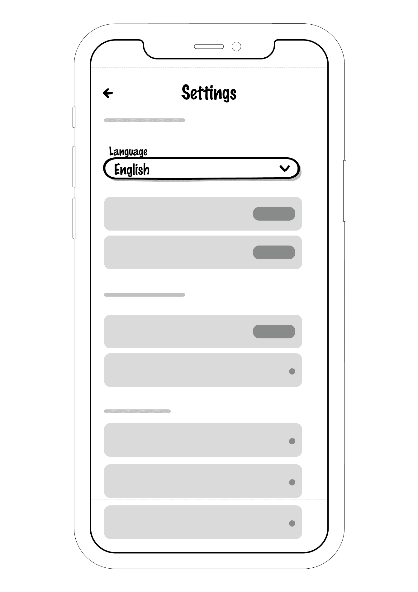
More options
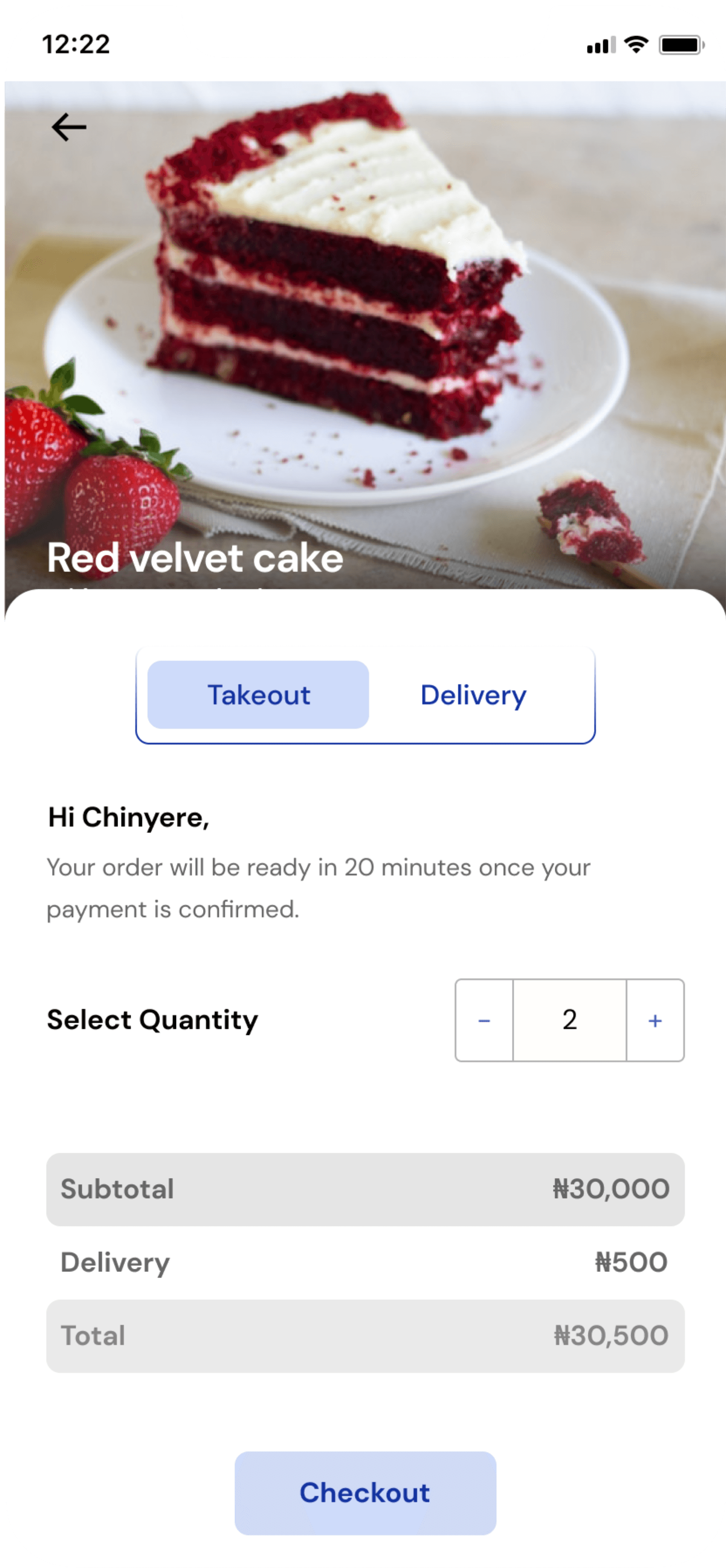
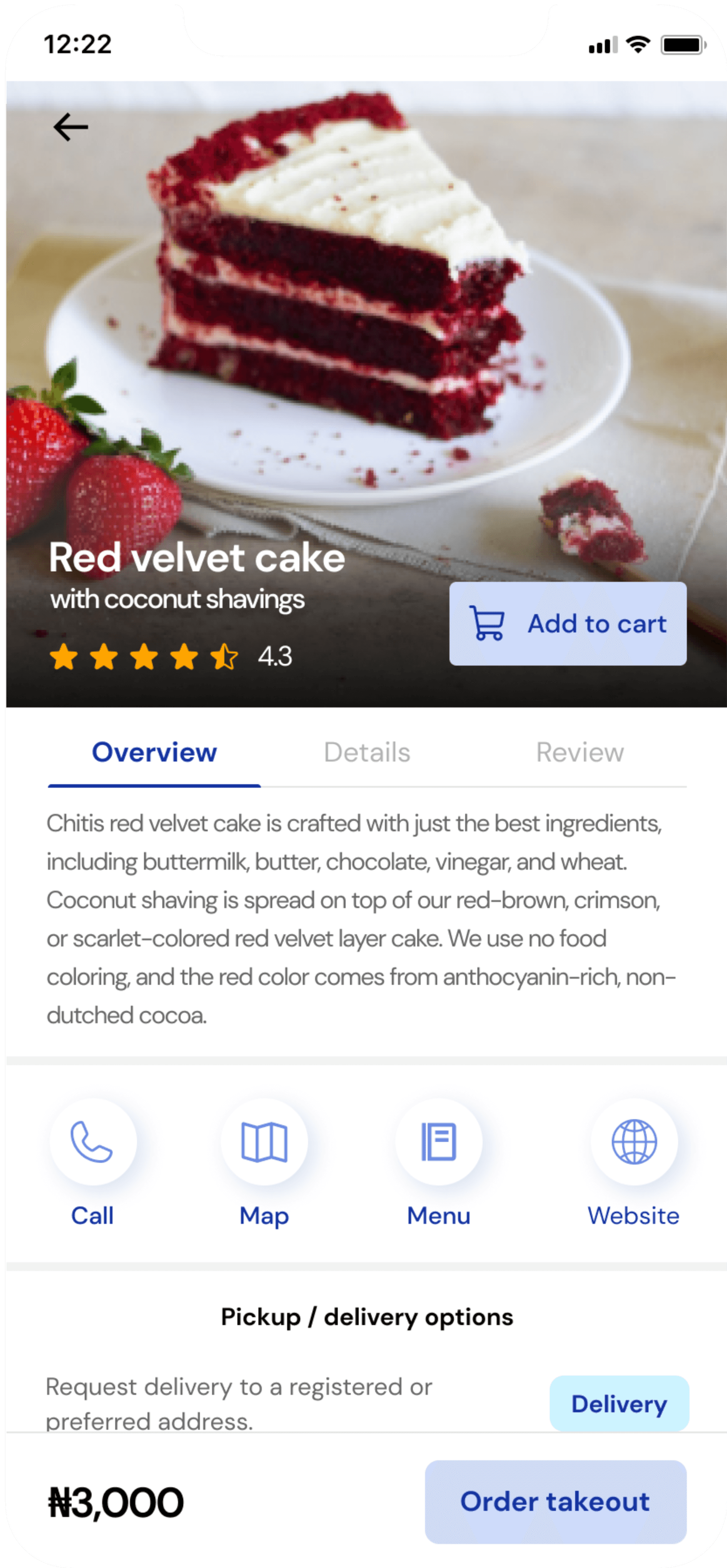
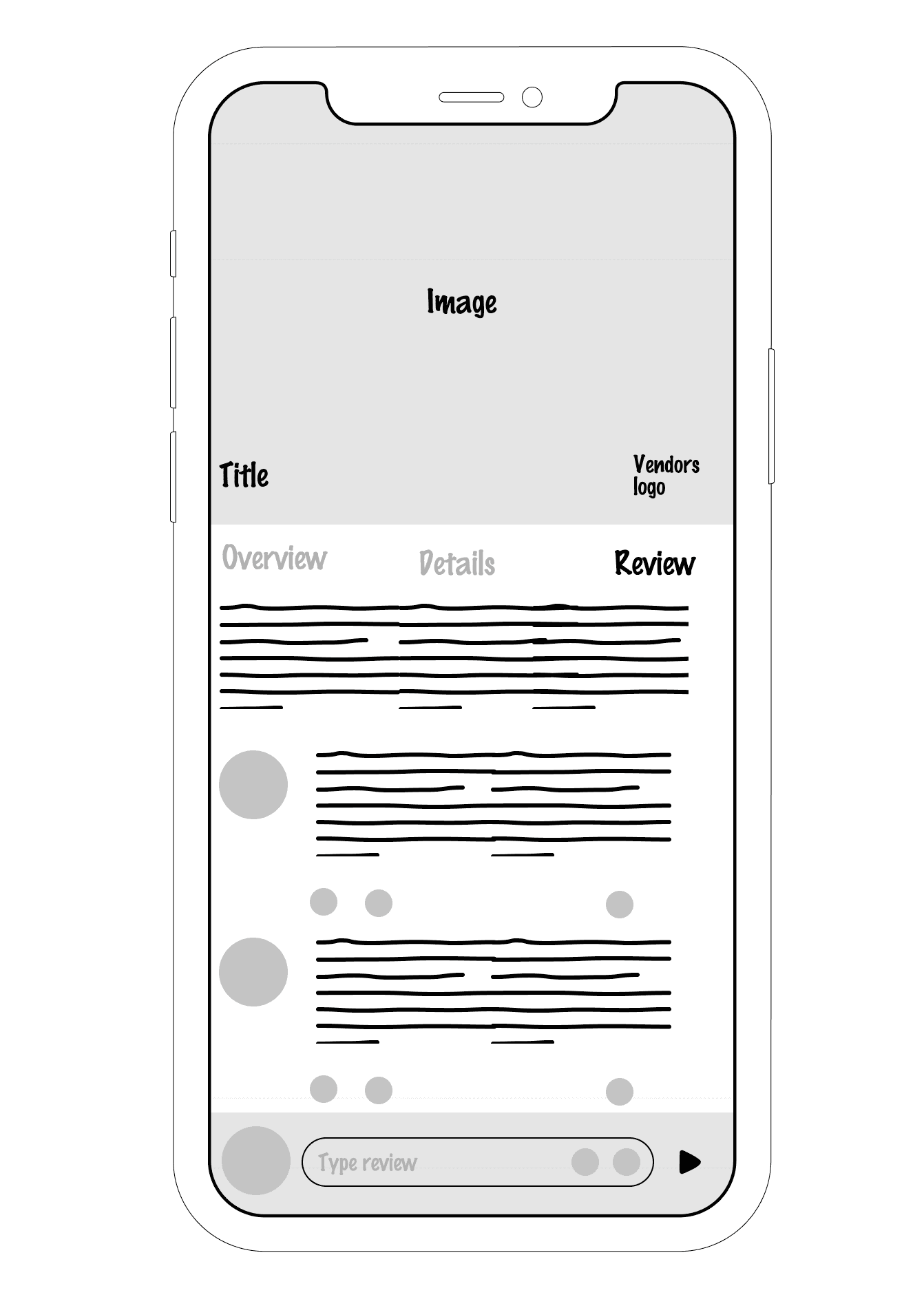
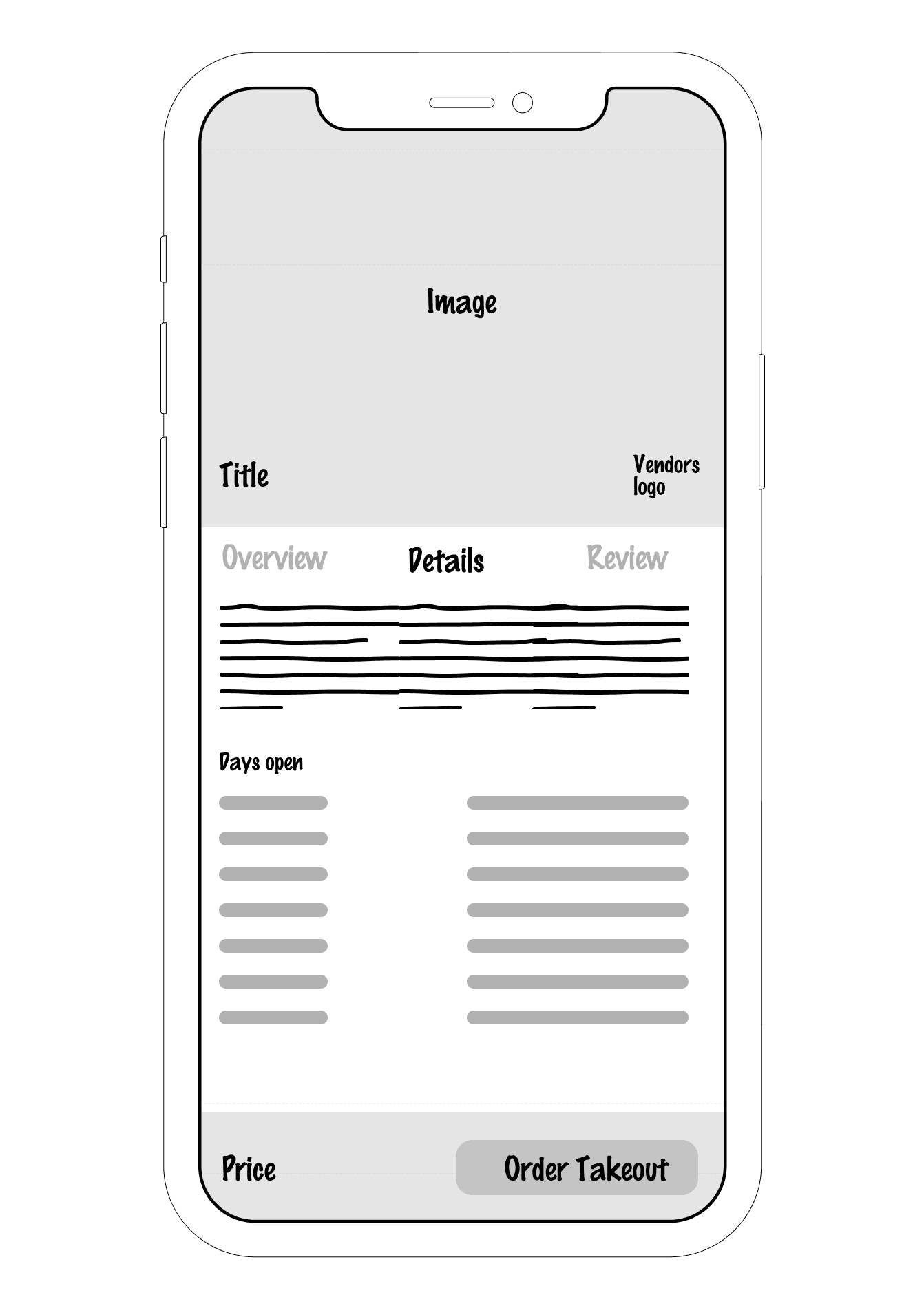
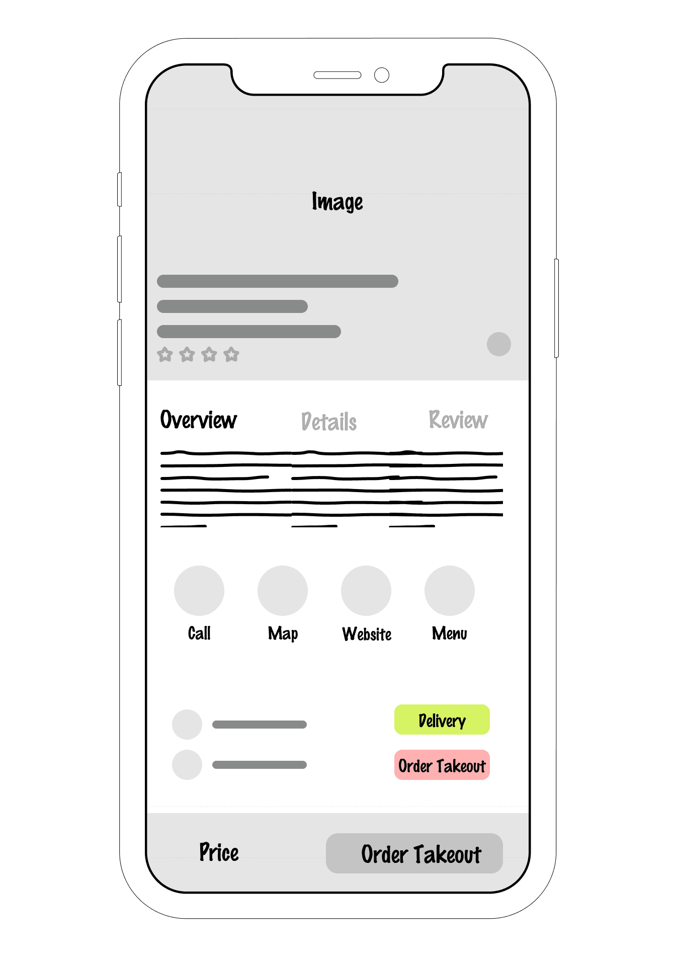
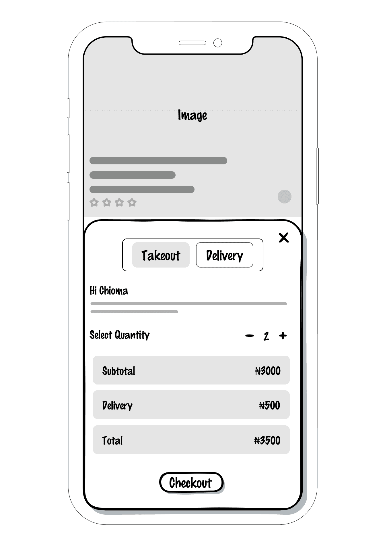
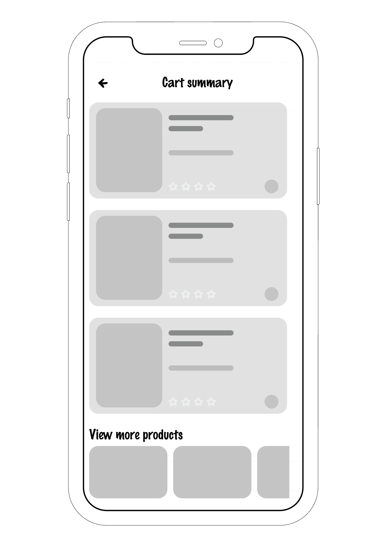
Product details / ordering process
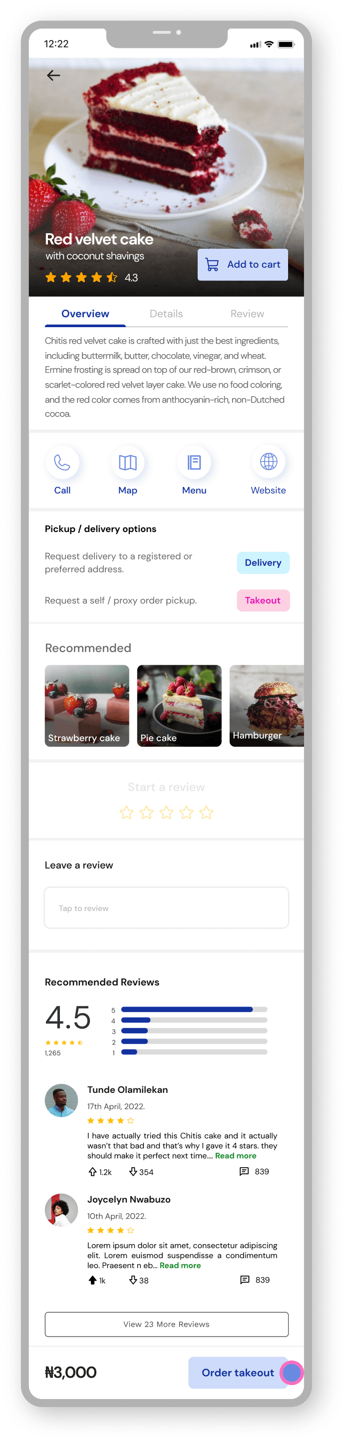
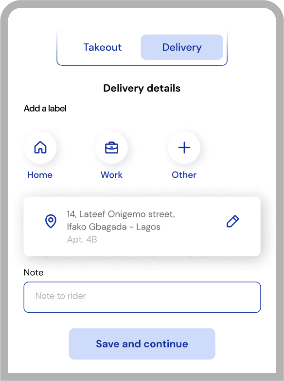

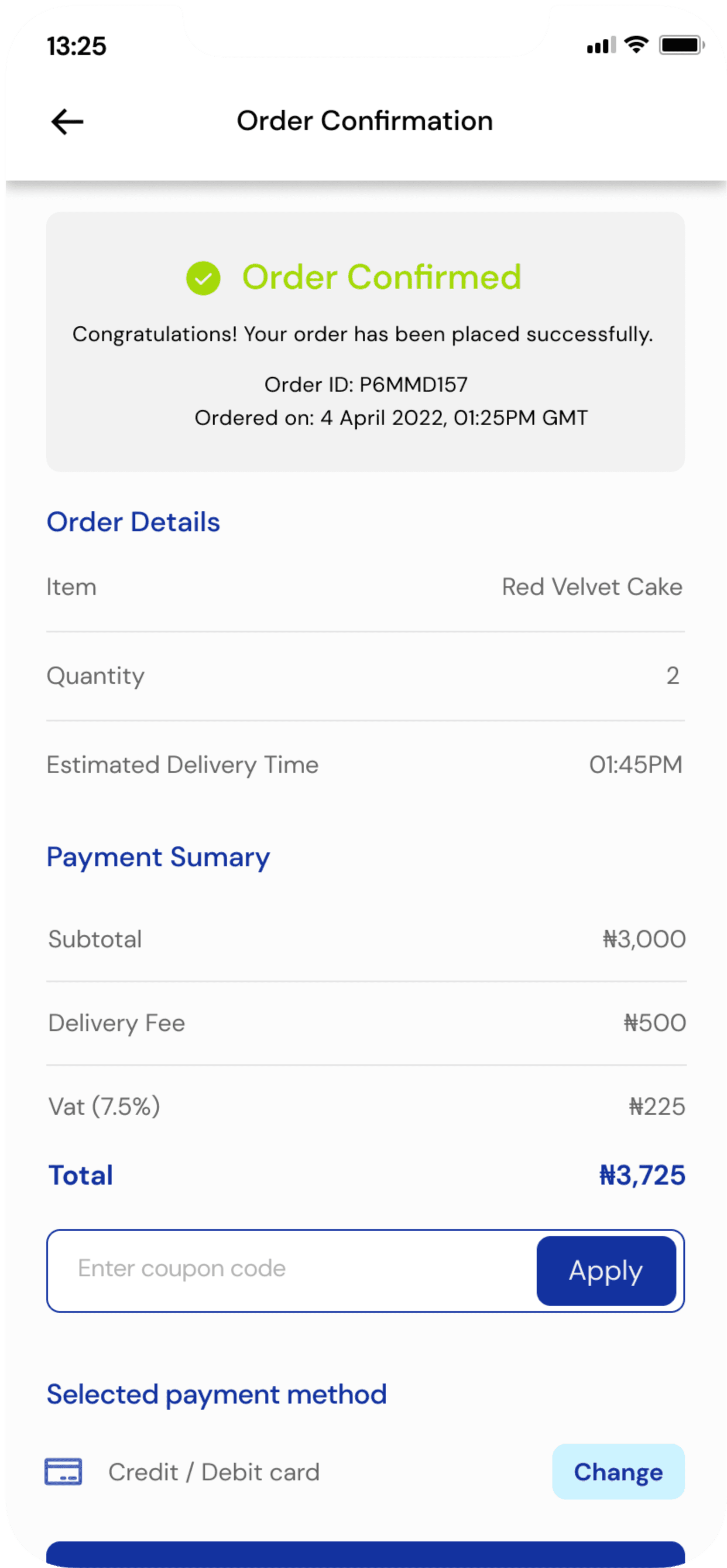
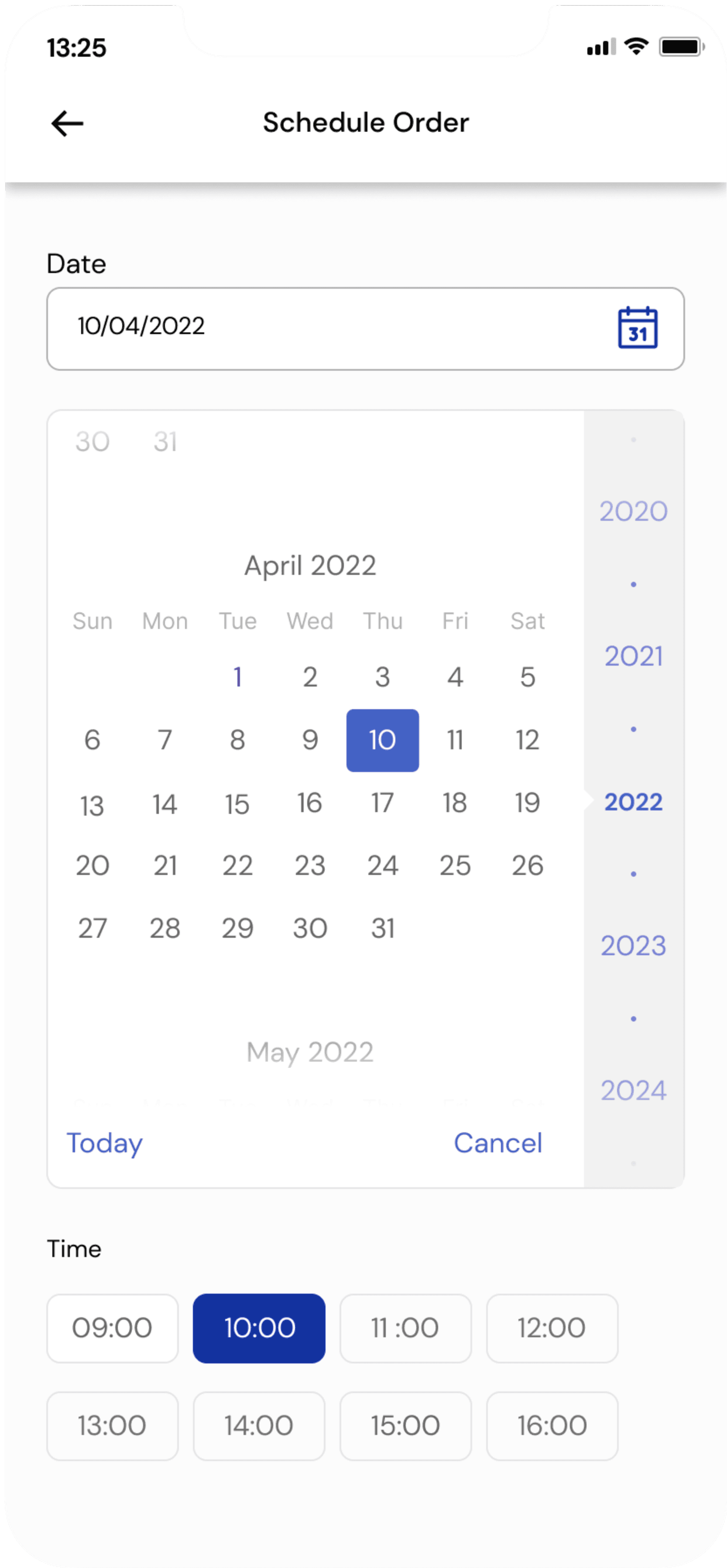
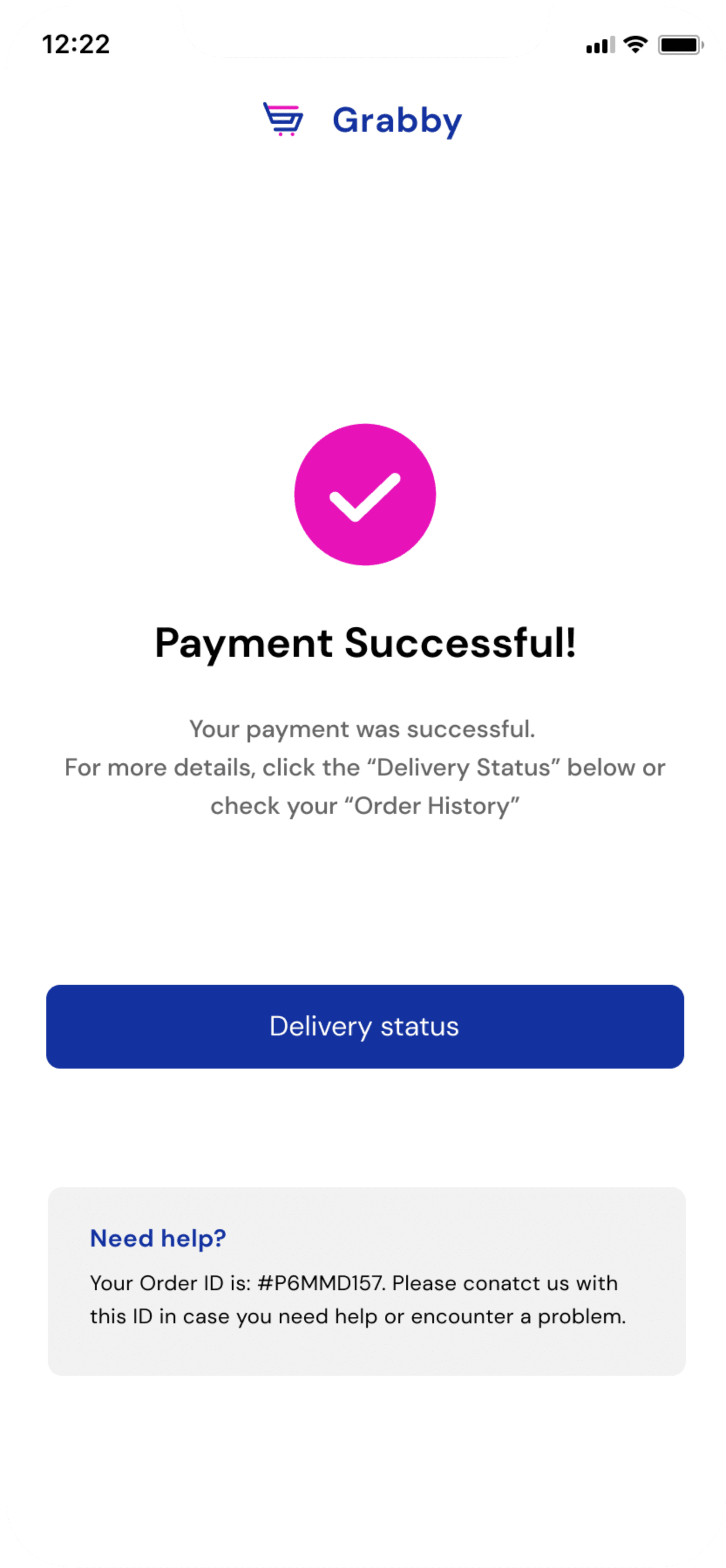
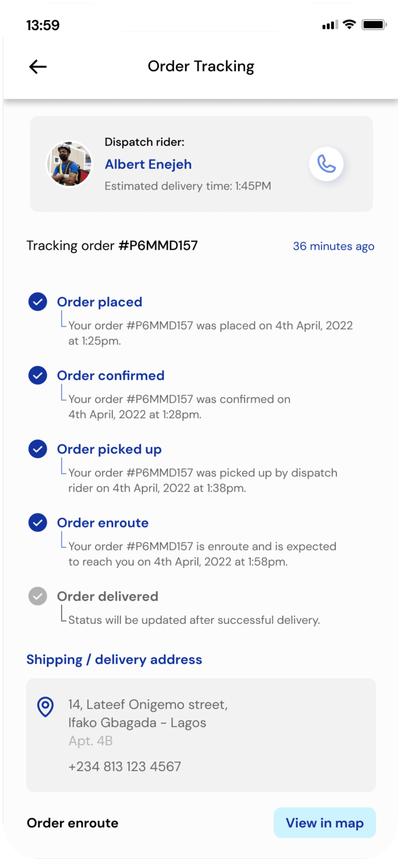
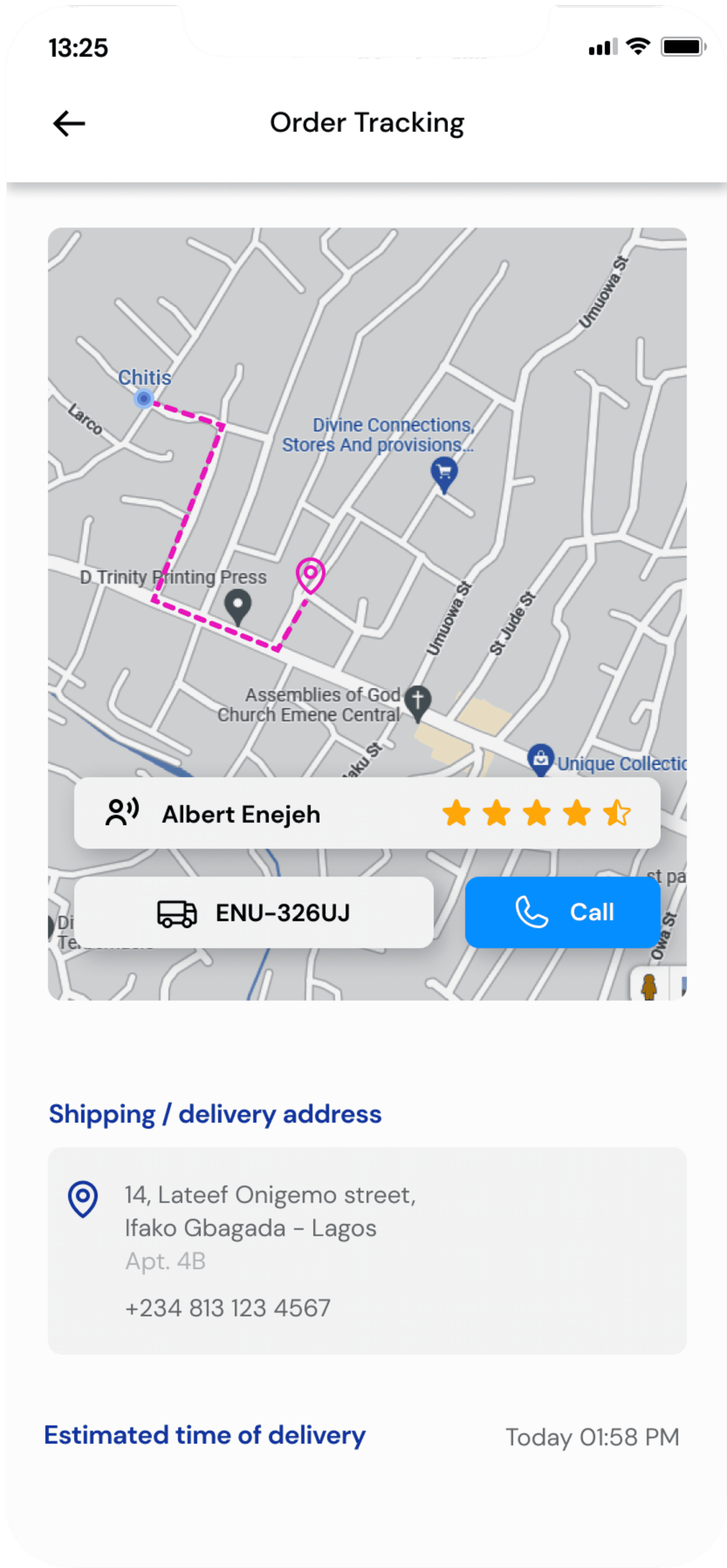
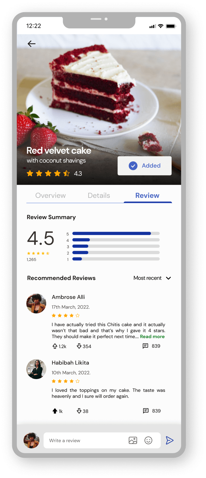
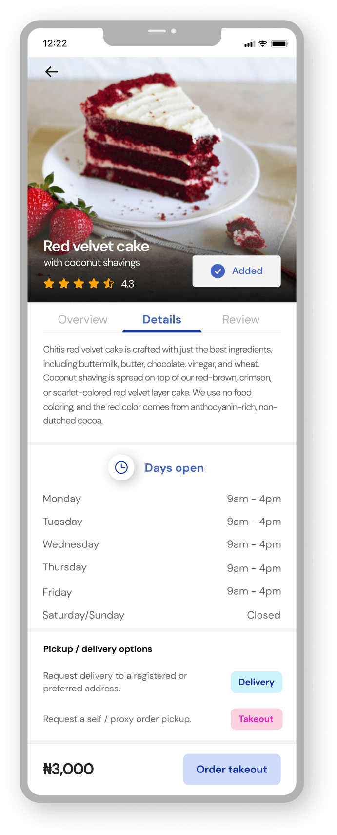
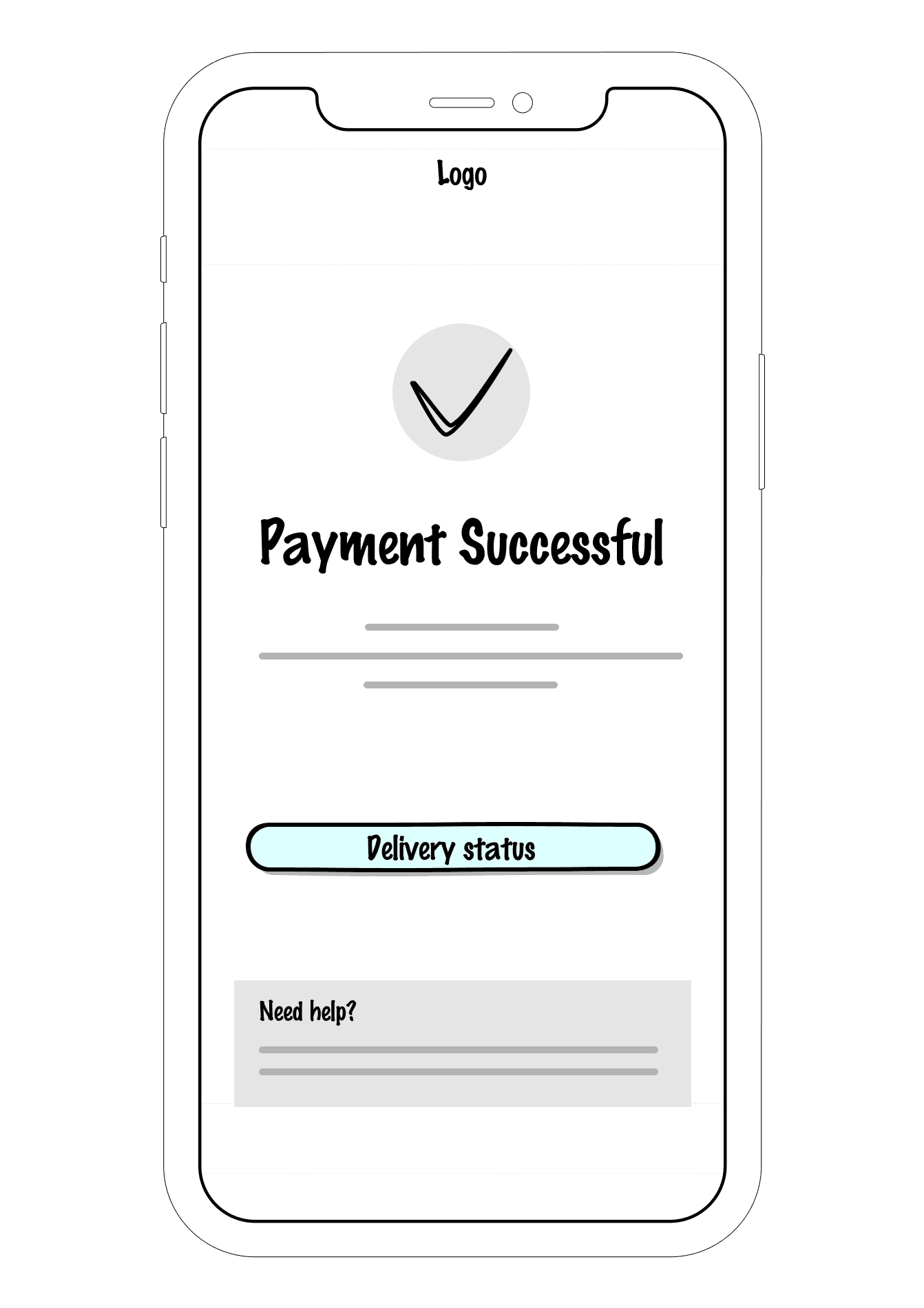
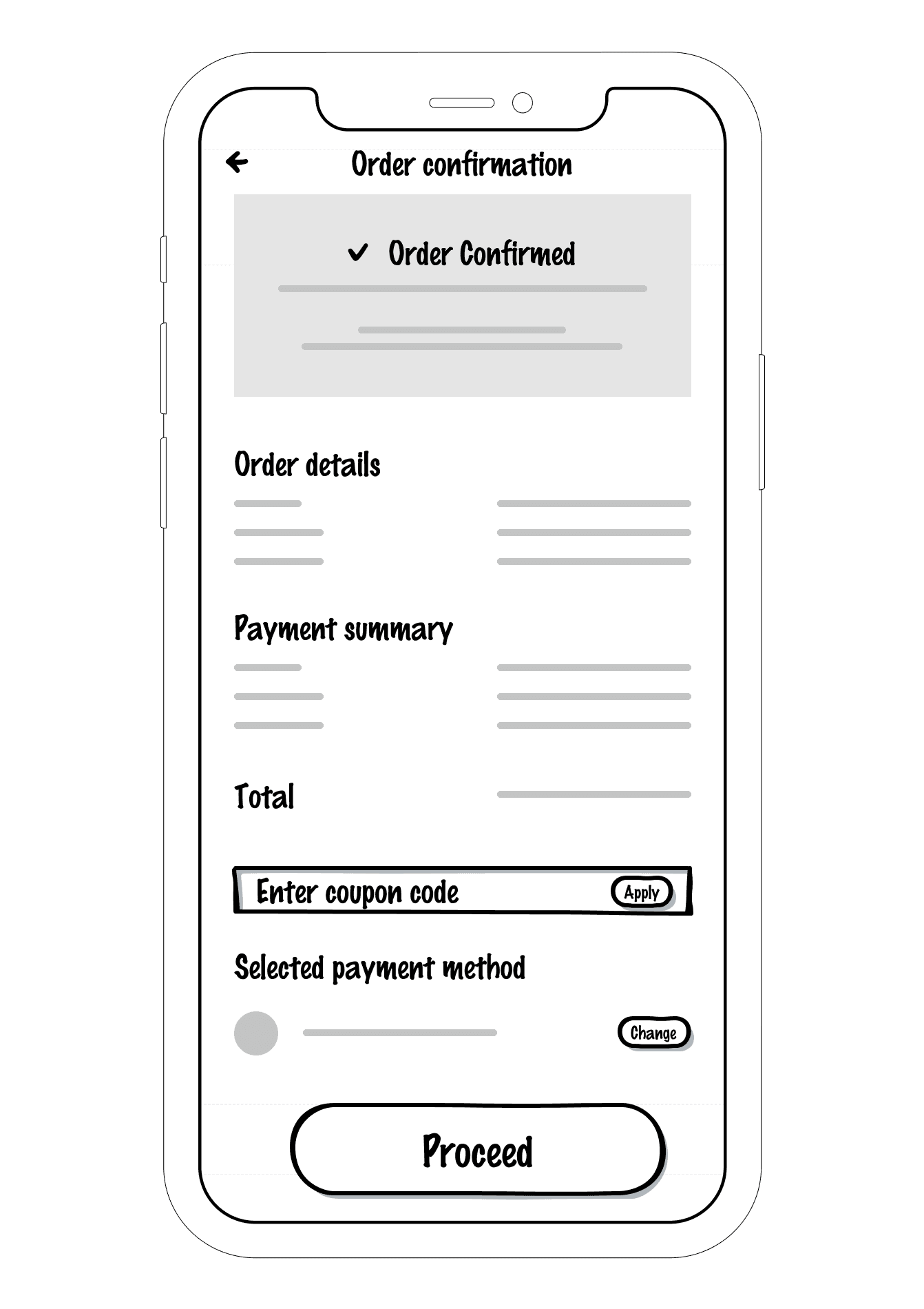
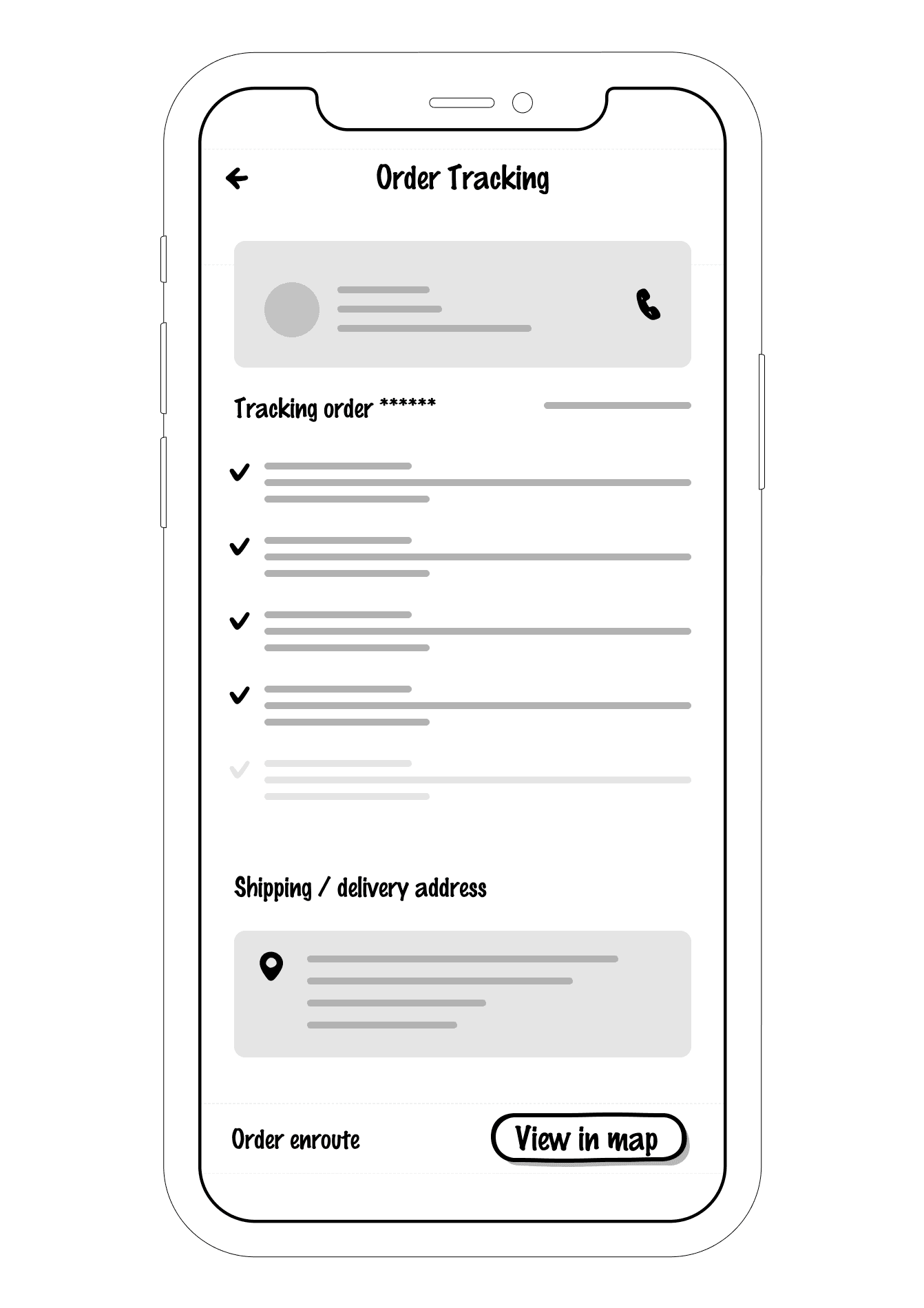
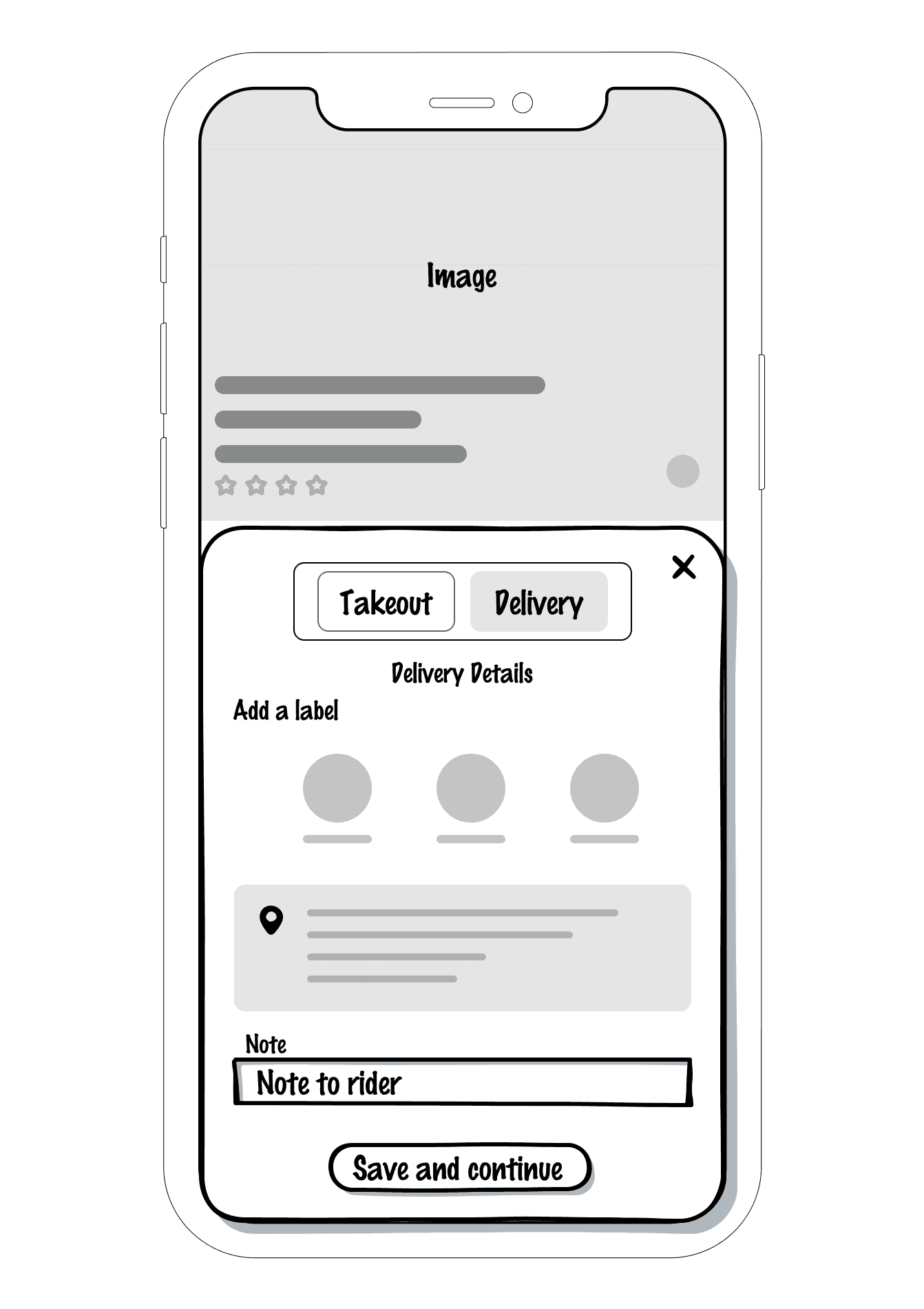
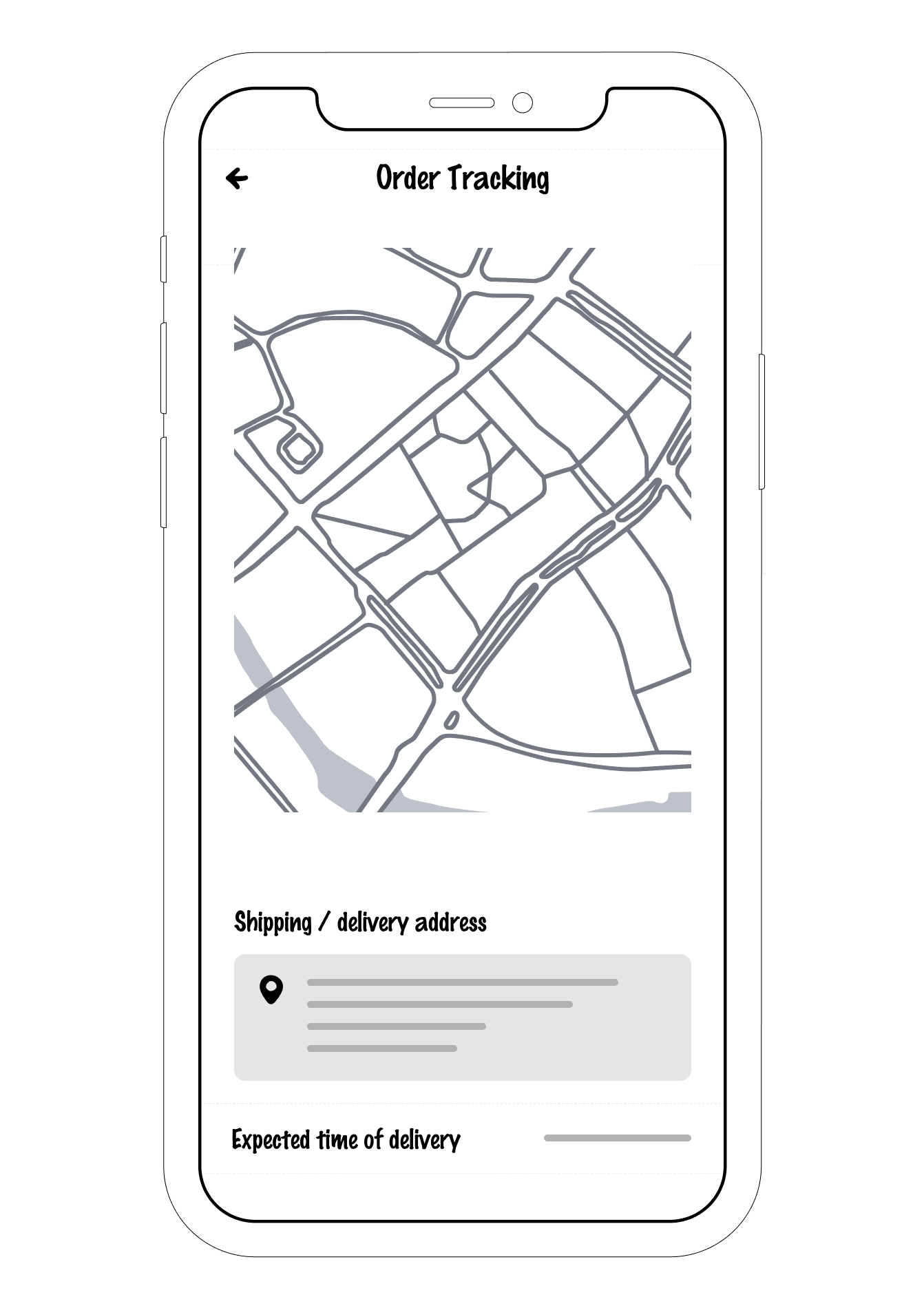
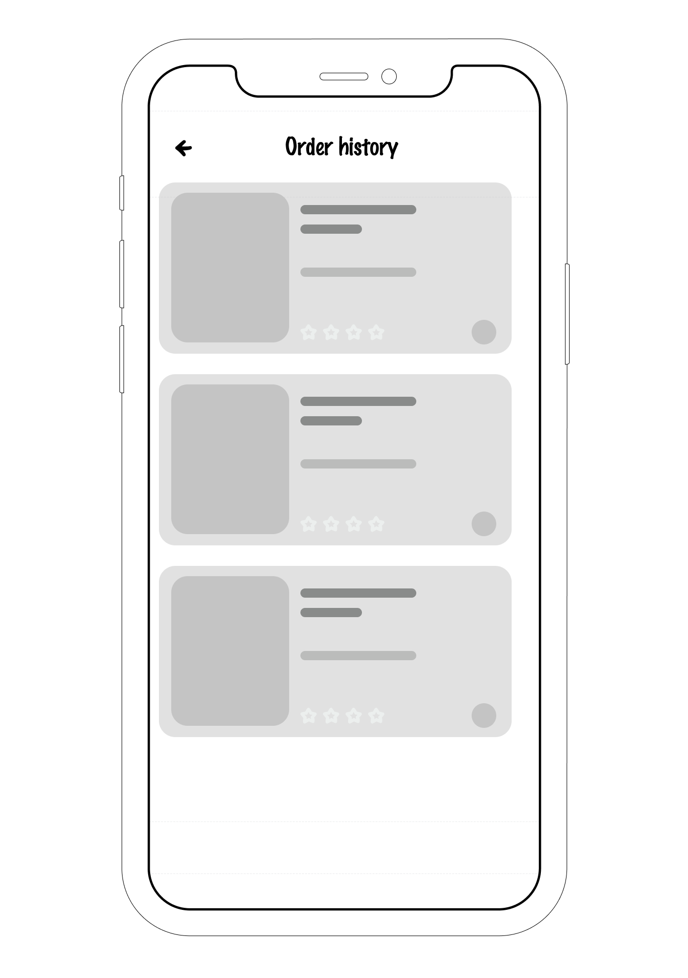
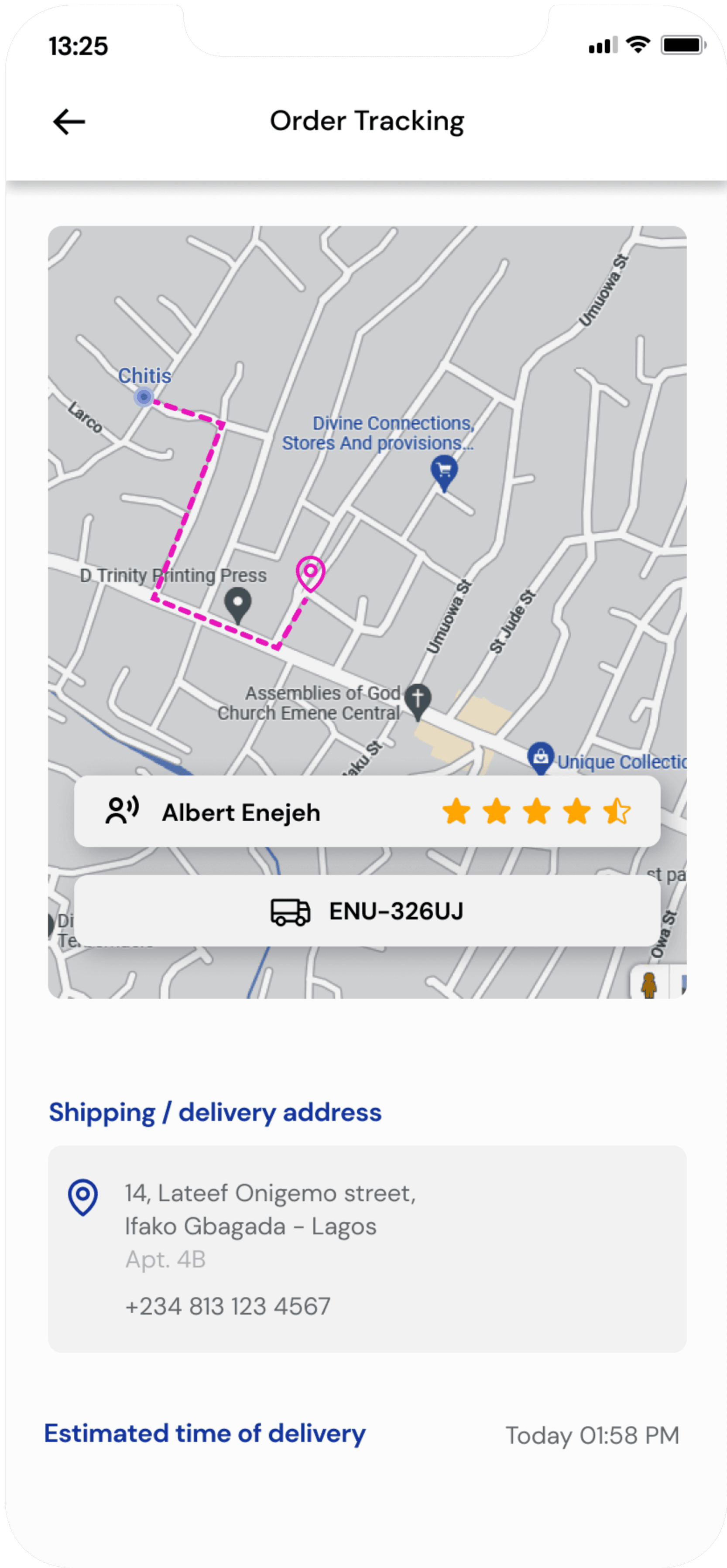
The ordering process is smooth and easy. The user is able to see more details about the highlighted product, choose between pickup or delivery, schedule orders, track order delivery in real time and make direct contact with the dispatch rider.
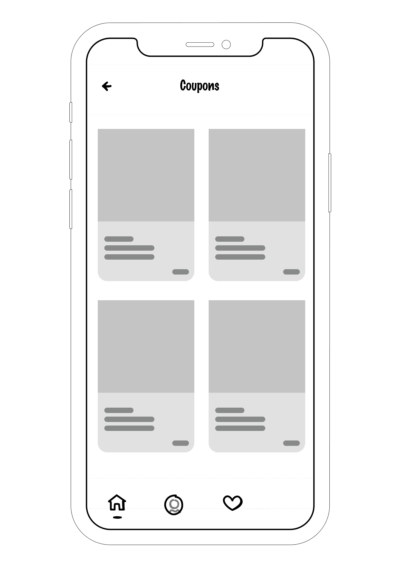
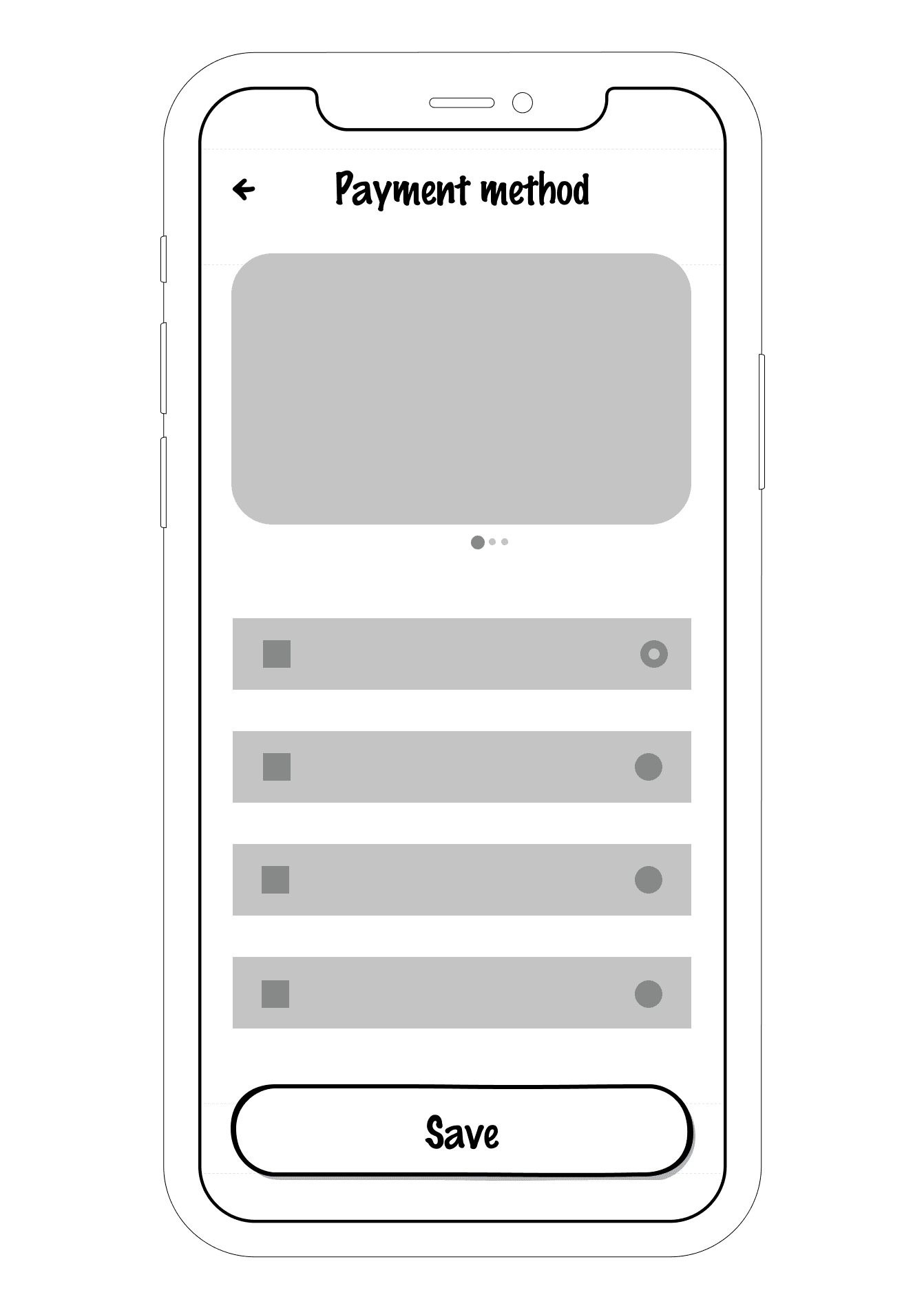
The payment process is secure with various payment method. The user is also able to benefit from coupons/vouchers discount.
Usability Testing
Key Insights
To reveal areas of confusion and uncover opportunities to improve the overall user experience.
Through usability testing, we can find design flaws we might otherwise overlooked.
Identify how long it takes to complete specified tasks.
Find out how satisfied our users are with our mobile design or other product
Before usability study
Before usability study
After usability study
After usability study
Following the usability test, I found that relocating the form field to the top part of the page, ahead of the social sign-up options, resulted in improved user focus on the primary task of signing up for the solution. While the social sign-up options were still retained, they were moved to a secondary position.
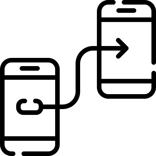
After usability test, users discovered the necessity for the provision of the dispatch rider’s contact information.
This will enable easier location of package drop off point and collection of package upon arrival of rider.
Usability testing is done by representatives of real life users who are likely to reveal issues that people familiar with a website can no longer identify. This is a necessary step to make sure you build an effective, efficient, and enjoyable experience for your users, it is often conducted repeatedly, from early development until a product’s release.
Lessons
As frustrations comes up daily, the need for solution is also a necessity. An accessible interface fosters a culture of innovation and user-centricity at every level of business. I considered the below points:
Thank you
Redefining the problem space and seek out the challenge that’s really worth solving.
Coming up with solutions, products, or services that are desirable for the user, economically viable from a business perspective, and technologically feasible.
Enabling early and frequent testing that will help minimize risk, drive customer engagement, and ultimately boost the bottom line.
Lessons Learned